"How Might We help a solo chef have a more convenient delivery service, so he can spend more time with his family?"
About the Project
Client: Premium Choice Meals
Business Context: Custom Diet Food Kitchen & Delivery Service
Operating Model: Solo Business
My Role: Service Designer, UX Researcher, UX Strategist, UX Writer and Brand Concept Designer
Final Delivery: Brand Strategy, Visual Brand Identity & Design Language System (DLS), Service Design Blueprint, Web Design
Methodologies
The Research
Secondary Research: Business Model Canvas, Ecosystem Mapping, Competitive List, Service Touchpoint Inventory
Qualitative Research: User & Founder Interviews, Ethnographic Observations (AEIOU)
Quantitative Research: Online Survey
The Analysis
Affinity Map, As-is Customer Journey Map, As-is Experience Map, Business Objective Model Canvas, Value Proposition Canvas, As-is Service Blueprint
Project Overview
The Backstory
What started as a request for a "new logo and website" evolved into a foundational service design overhaul. To prevent founder burnout and ensure long-term sustainability, I proposed a full-scope strategy: Redefining the brand values and business model before translating that new DNA into a digital experience.
The Challenge
The client, a solo founder, prioritized family and community over aggressive scaling, yet his Value Proposition was built on unverified assumptions.
The Friction Point: A manual phone and WhatsApp ordering system.
The Result: Frequent delivery errors and operational exhaustion.
The Goal
To harmonize a solo entrepreneur’s personal values with a high-performance, friction-free customer experience.
The Solution
Strategic Realignment: Reframed the business value proposition to bridge the gap between owner assumptions and actual customer needs.
Service Optimization: Engineered a frictionless e-commerce flow that allows customers to seamlessly compare and purchase meal subscriptions.
Visual Trust: Translated the strategy into a professional visual identity and a scalable Design Language System (DLS), establishing authority in the healthy meal delivery market.
────
The "Double Diamond Design" Process Summary
1. Discovery
Understanding the Current Situation
Using secondary research methods and talking to my client, I mapped out the current situation as a first step, including the current customer touch points, business model, ecosystem map and competitor analysis.
This way, we were able to see the big picture and start discussing about the challenges and opportunities that were not aware of.
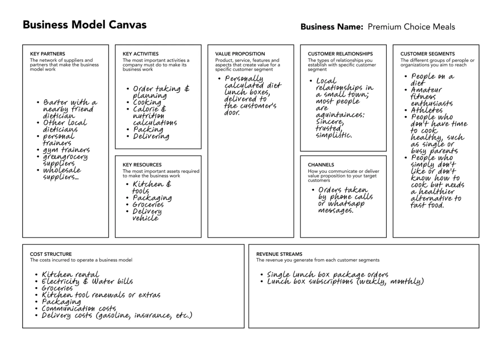
Business Model Canvas
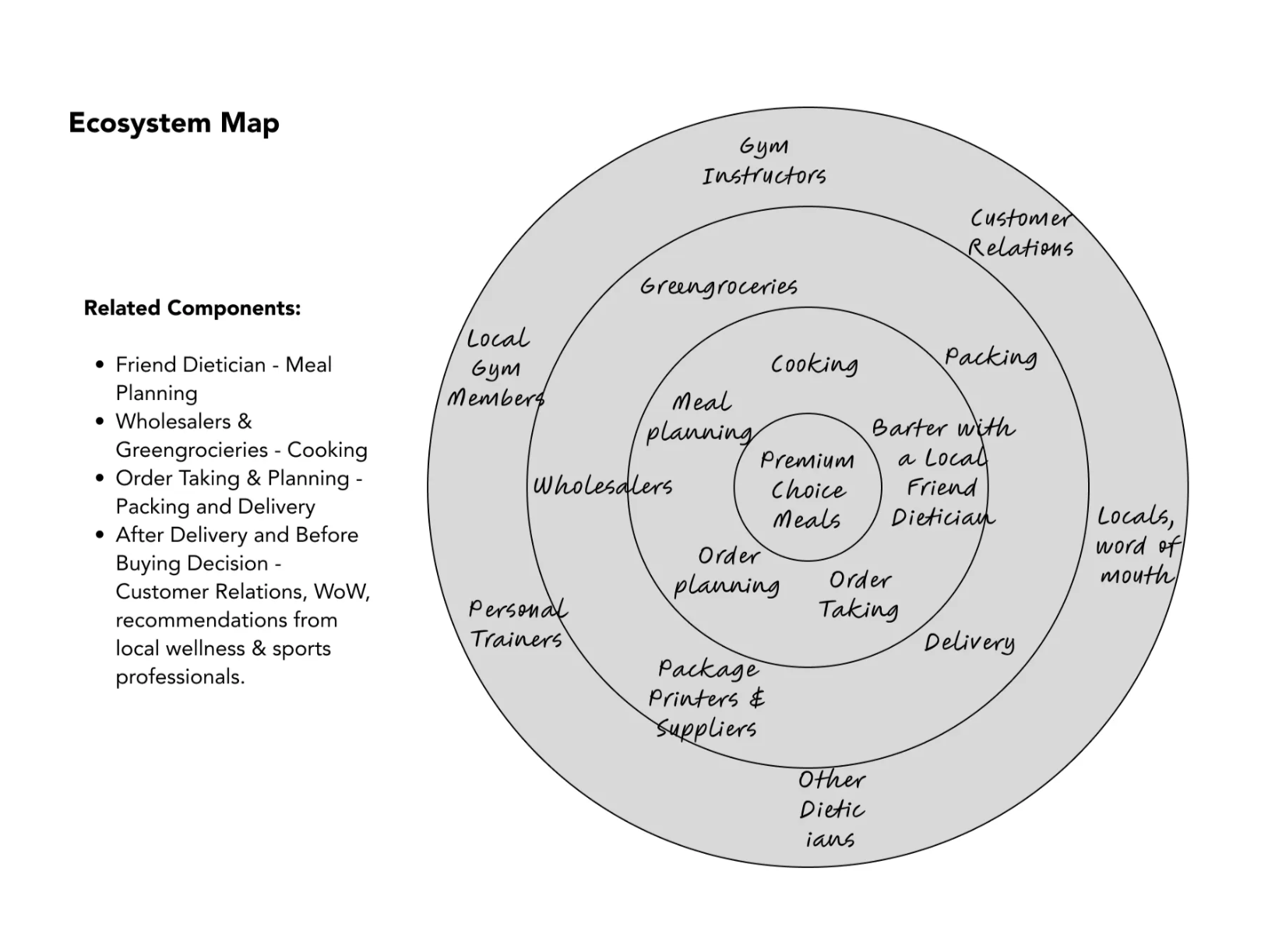
Ecosystem Map
Using Qualitative and Quantitative methods, such as business owner and customer interviews, also an online survey on potential customers, it became easier to understand the user's perspective more transparently.
My client also had the opportunity to make an ethnographic observation about his customers, with the techniques I provided him with.
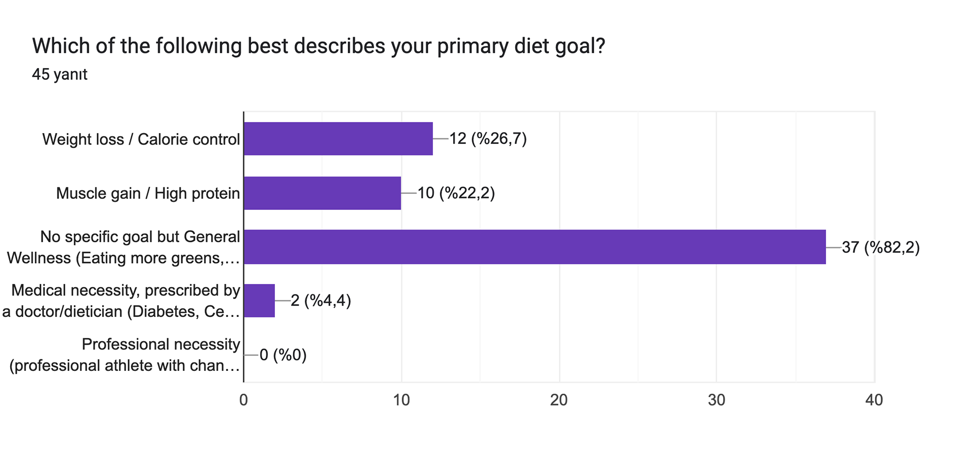
An Example Page from the Potential Customer Survey
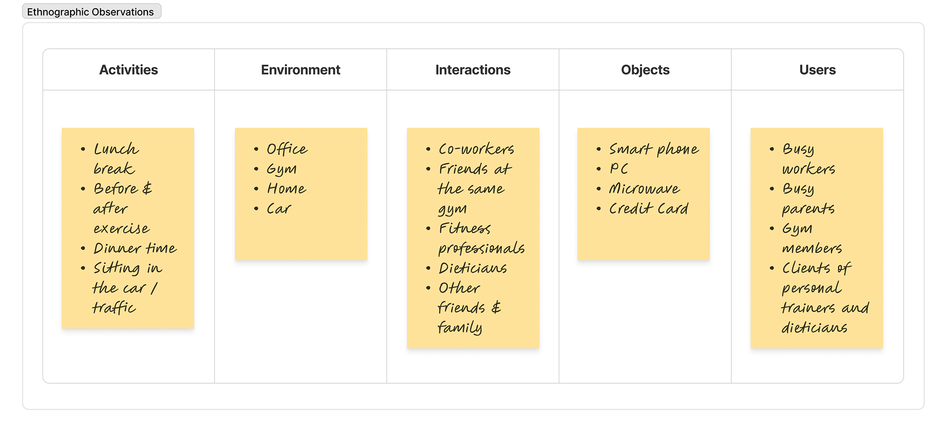
2. Definition
Defining Our Users
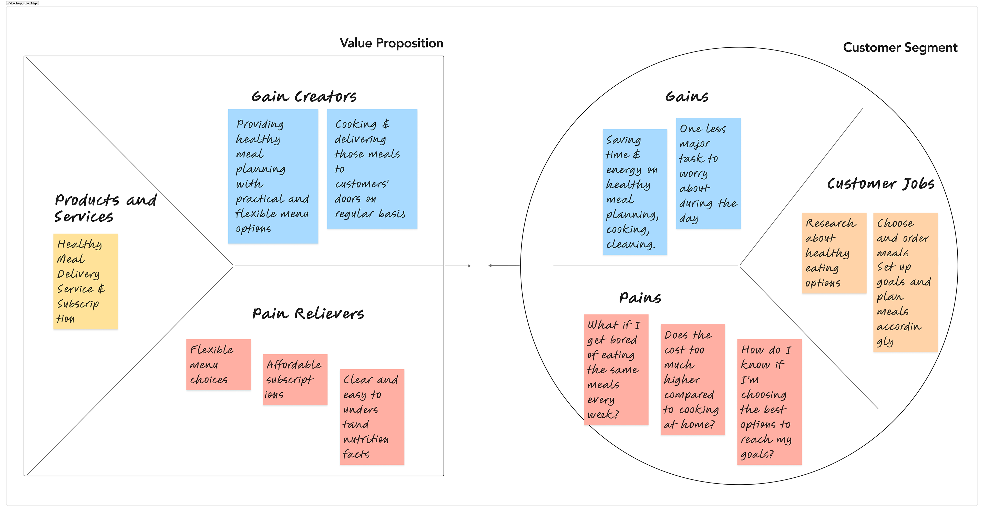
According to the research results, we found out that not everyone wanted a healthy meal were fitness enthusiasts, in fact, they were the minority.
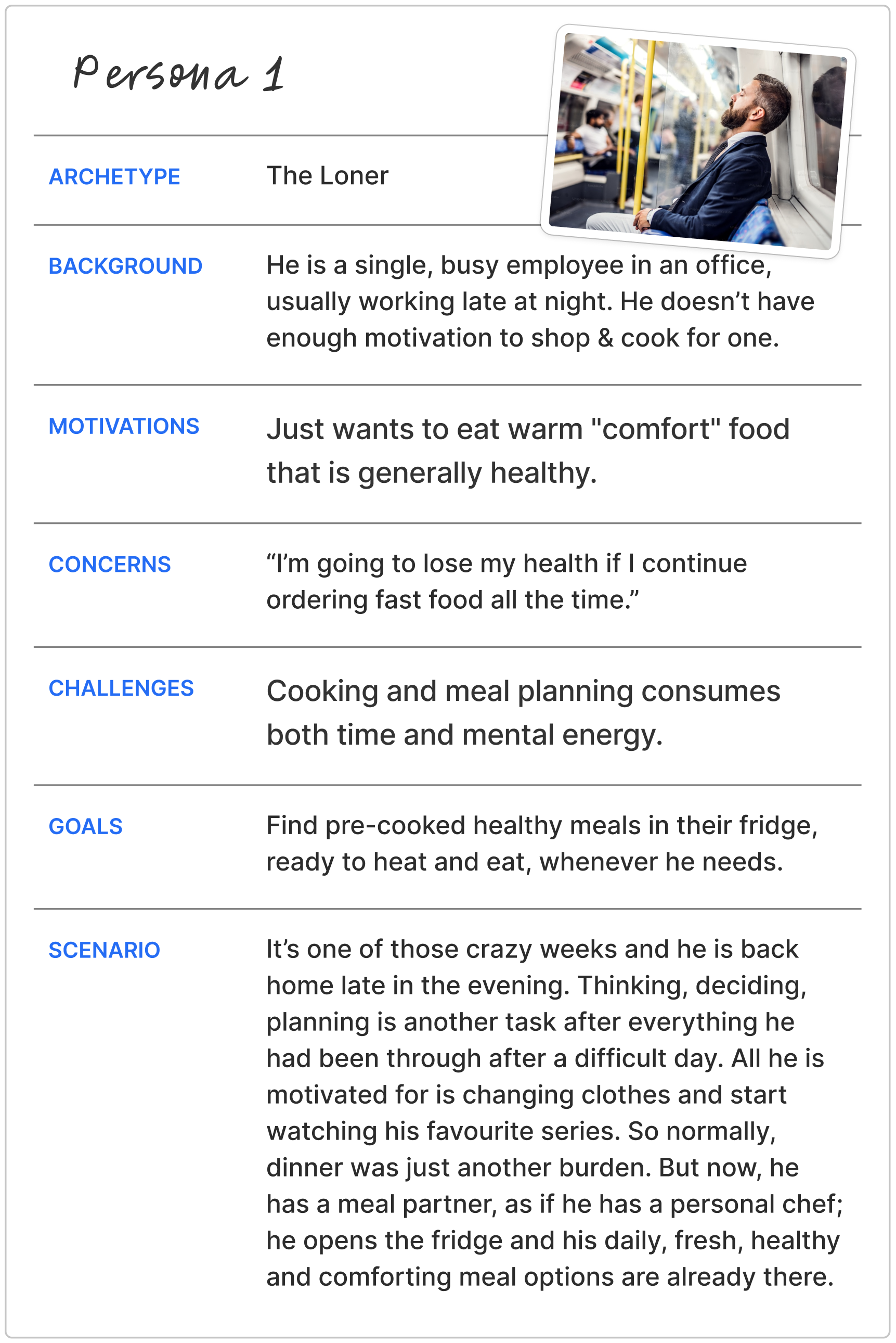
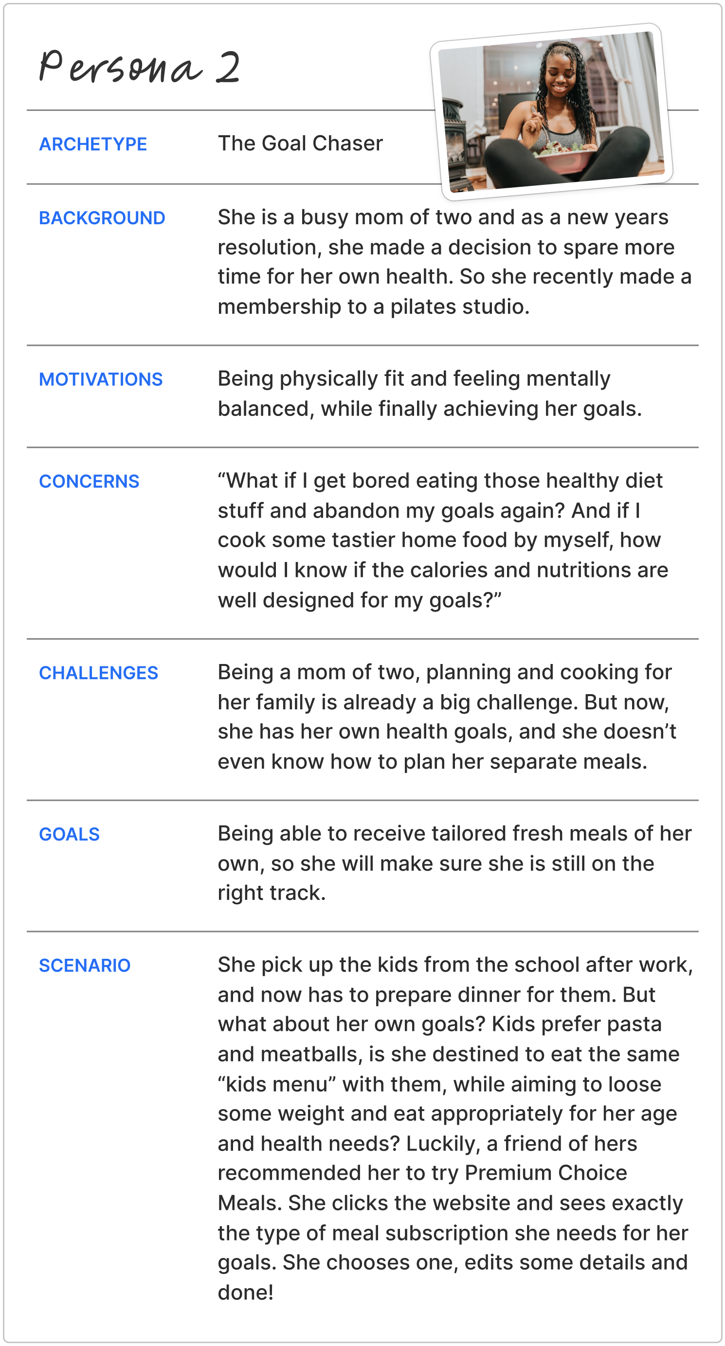
I found out that we actually had more than one user personas: The Loner, The Goal Chaser and the Fitness Enthusiast.
So, I built them according to this new vision, and my client and I used some ideation methods for the possible solutions.
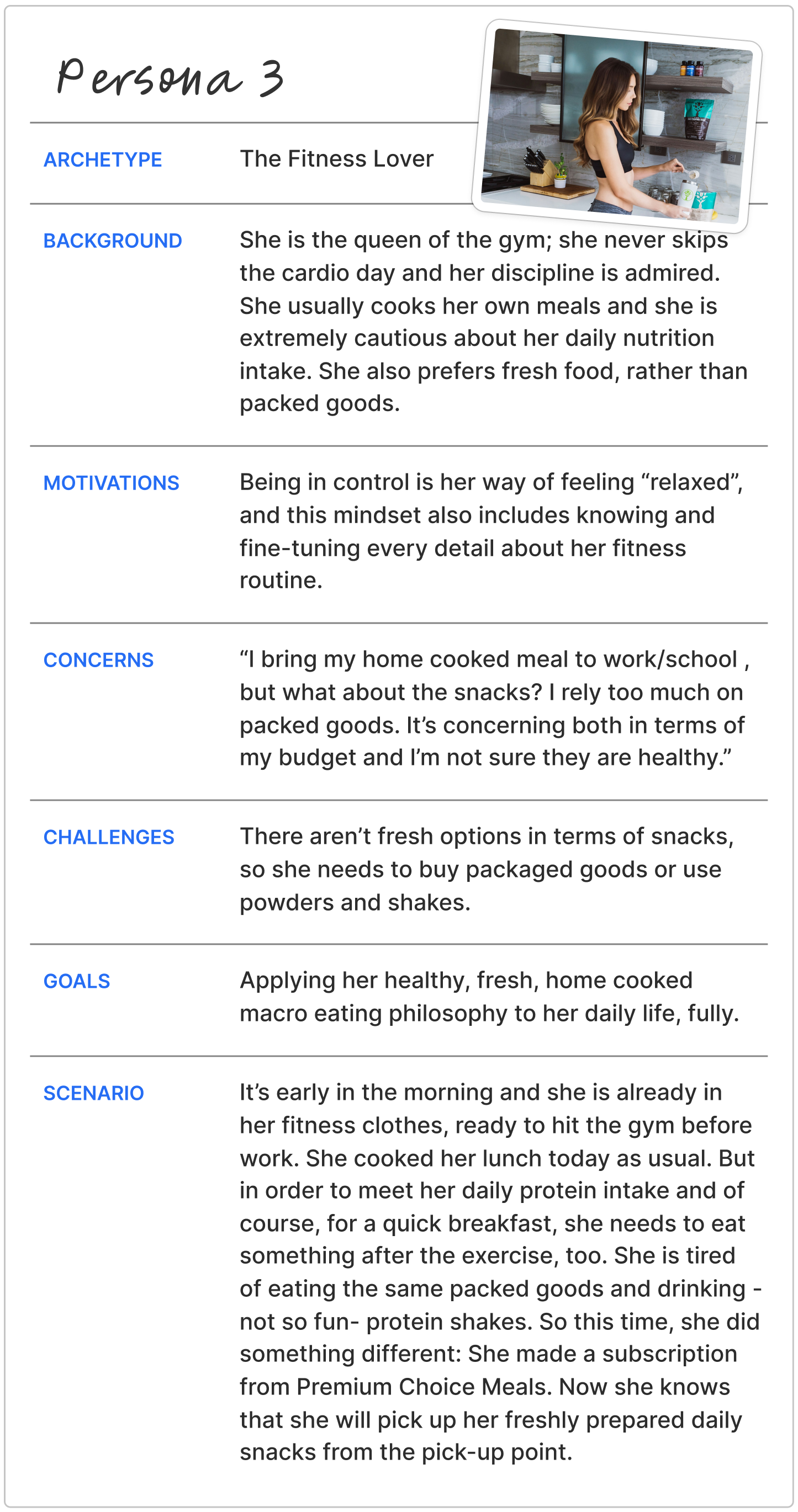
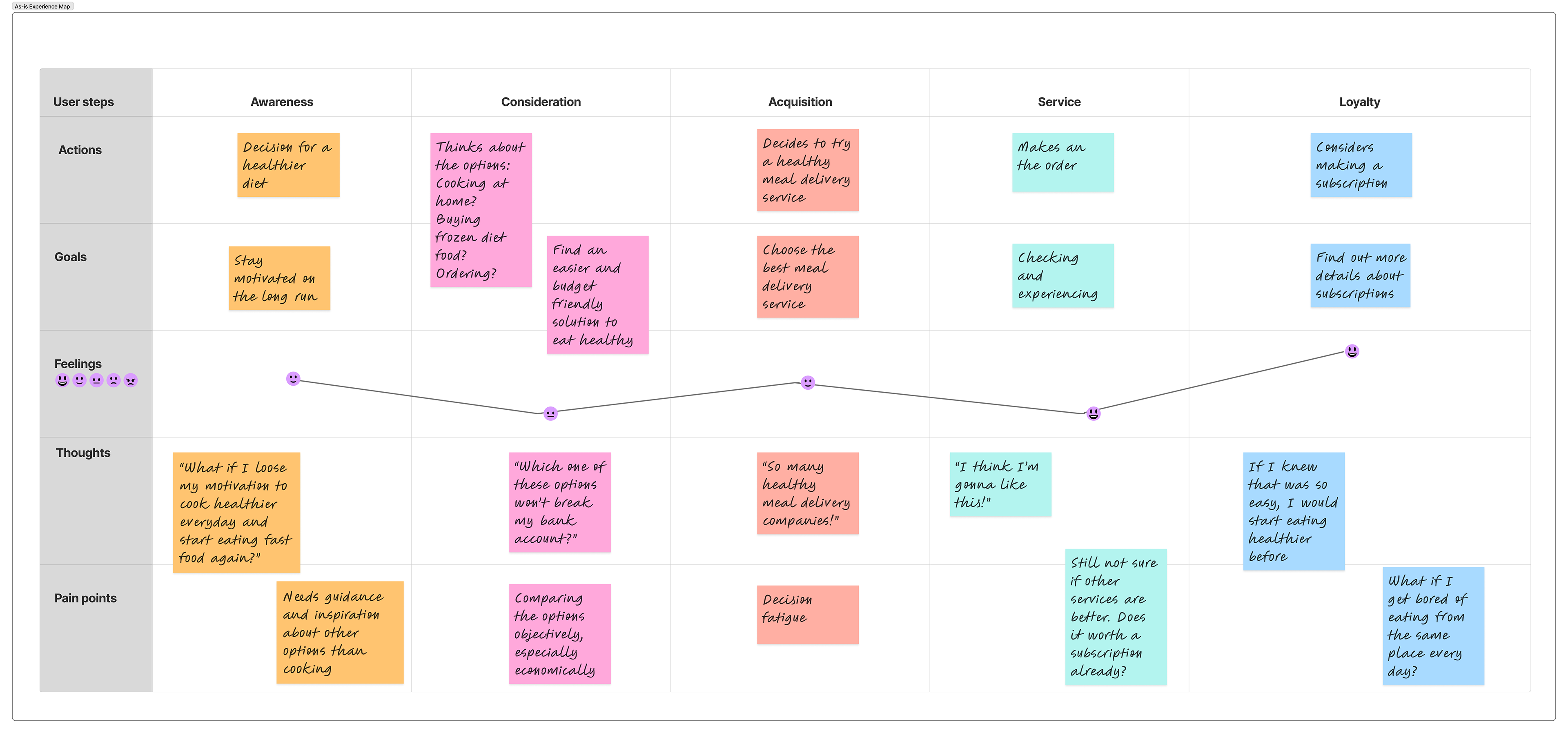
User's Current Experience and Their Pain Points
Invisible Brand: Customers are frustrated by your lack of social media presence and "static" digital footprint. They feel like they found a "hidden gem" that is too hidden.
Manual Overload: The current "Phone/WhatsApp only" system is viewed as "old school," time-consuming, and prone to human error (wrong ingredients/forgotten plans).
Subscription Fatigue: Without the ability to easily change or update their own plans, the subscription feels like a "burden" rather than a service.
Static Menus: Customers feel trapped by a website that doesn't update. They want to see what is available in real-time without having to ask.
Lack of Flexibility: There is no middle ground between "Strict Diet Plan" and "Random Choice." Users want to be able to toggle ingredients (e.g., swapping rice for veggies) without a 5-minute phone call.
Information Gap: Customers want to see nutrition facts (macros/calories) clearly displayed alongside the food, rather than trusting "blindly."
Competitive Threat: Larger services are tempting customers away not with better food, but with convenience (mobile apps, easy online ordering, and clear variety).
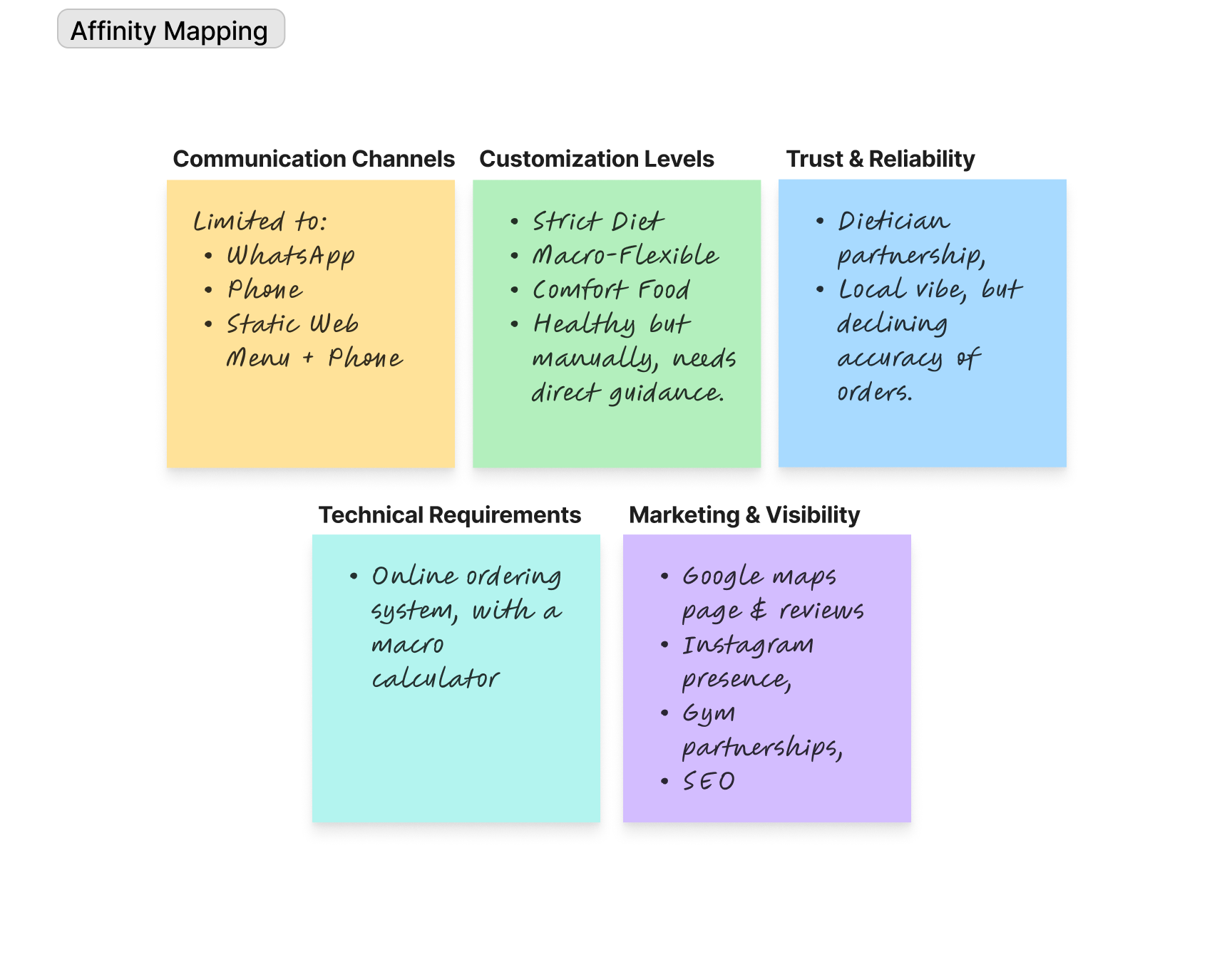
Affinity Map
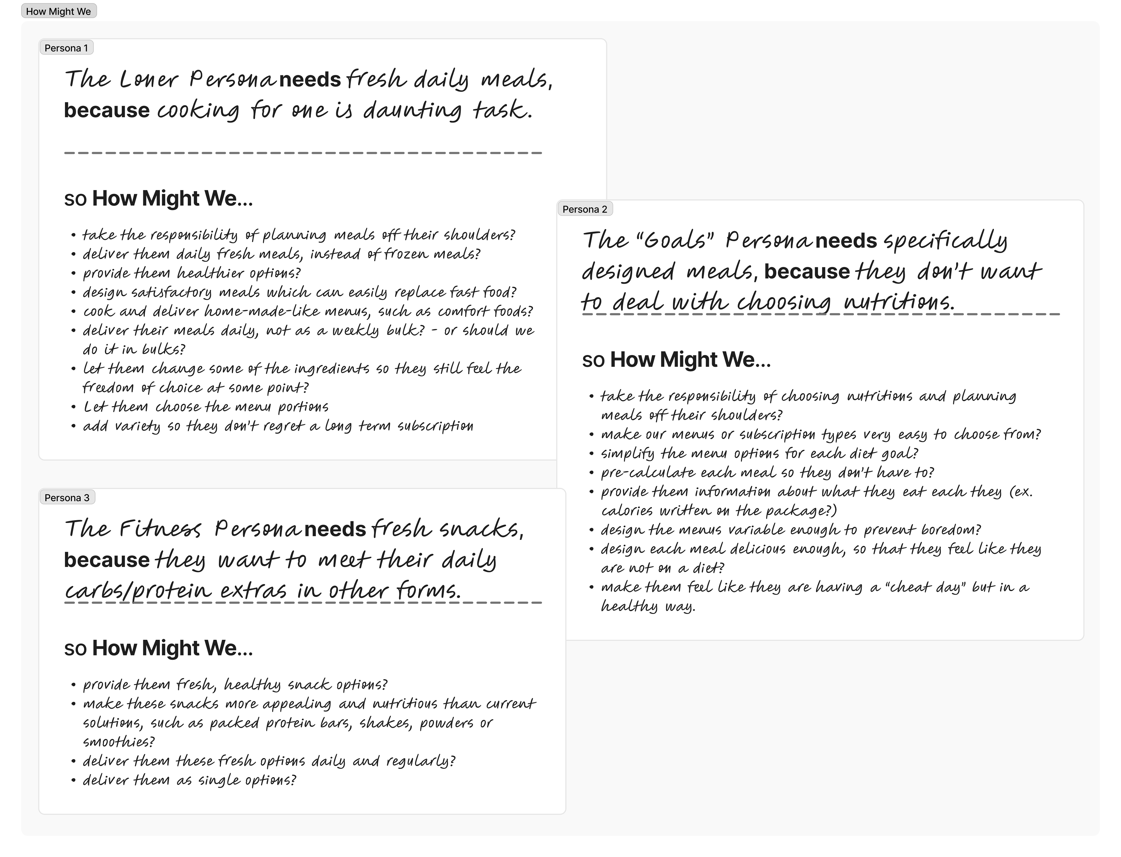
How Might We
Defining The Business Owner's Challenge
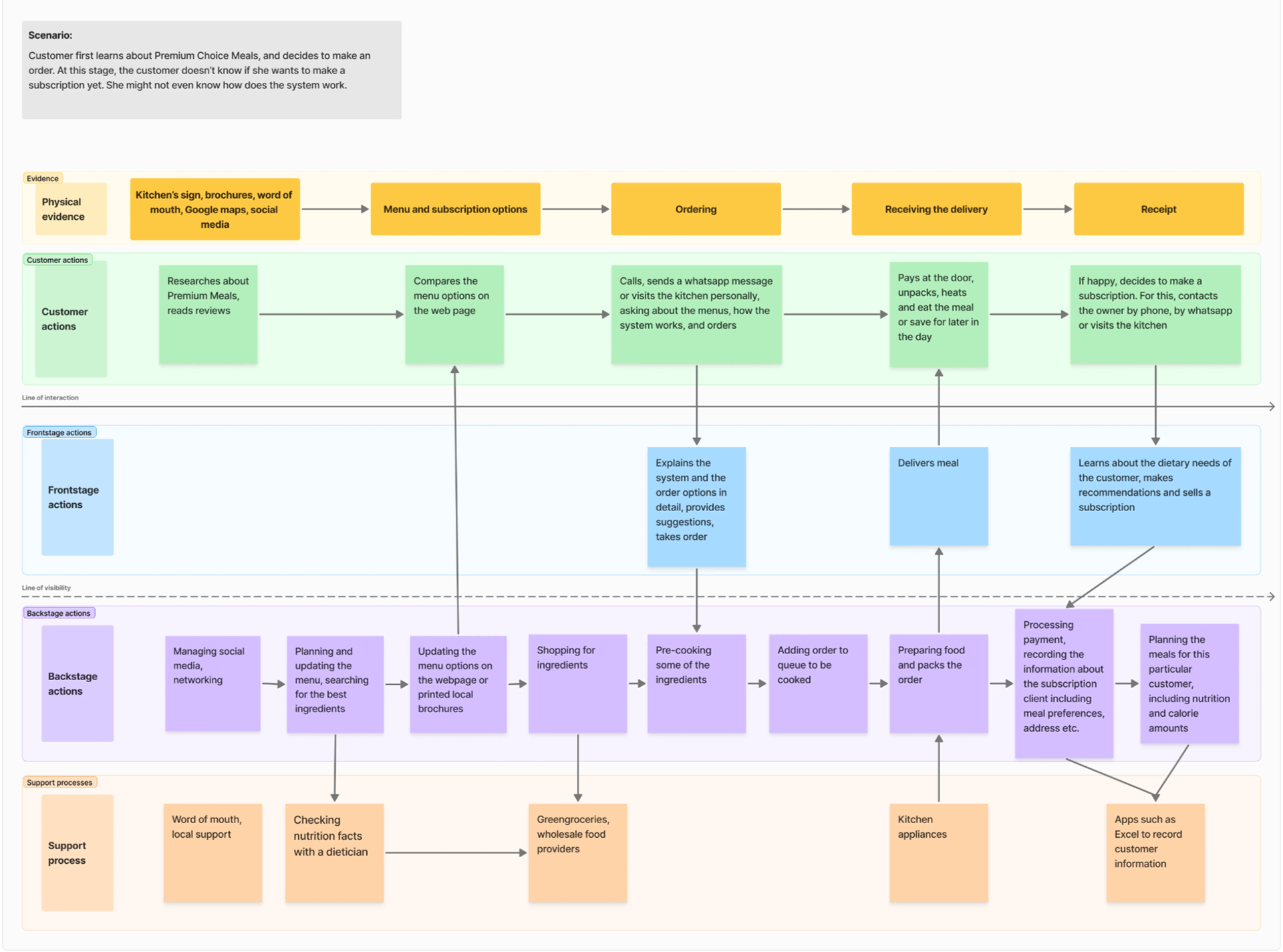
Our hero, the solo business owner had to take part not only at the front stage but also at the backstage actions. On the long run, it is not difficult to tell that this system was not sustainable.
He also had his own concerns, such as loosing personal touch in his sincere customer relations if he switches to a more automated service model.
3. Design
Thinking about the possible solutions that will benefit both ends
The solution I was expected to bring, shouldn't be limited to the user's perspective. The business owner's main goal was to ease his workload, while for the user, I had to design a friction-free ordering flow.
Because my client had a little budget and a very limited schedule, we should prioritise the next actions as well. So, we chose to focus on the easy wins first, and my client worked on adding variety to his menus. In the meantime, I was going to design the new service blueprint and and the user flow.
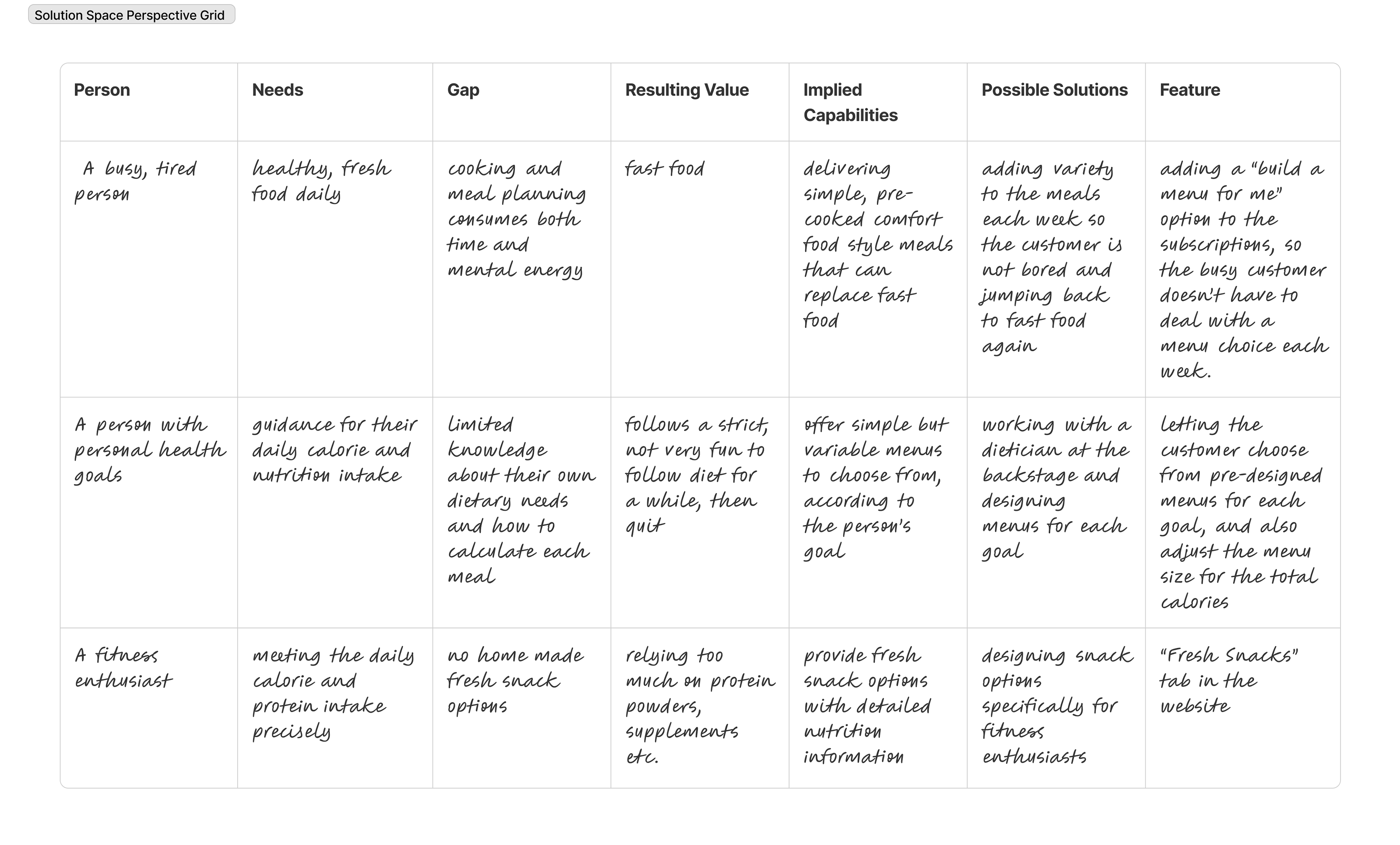
Solution Space Perspective Grid
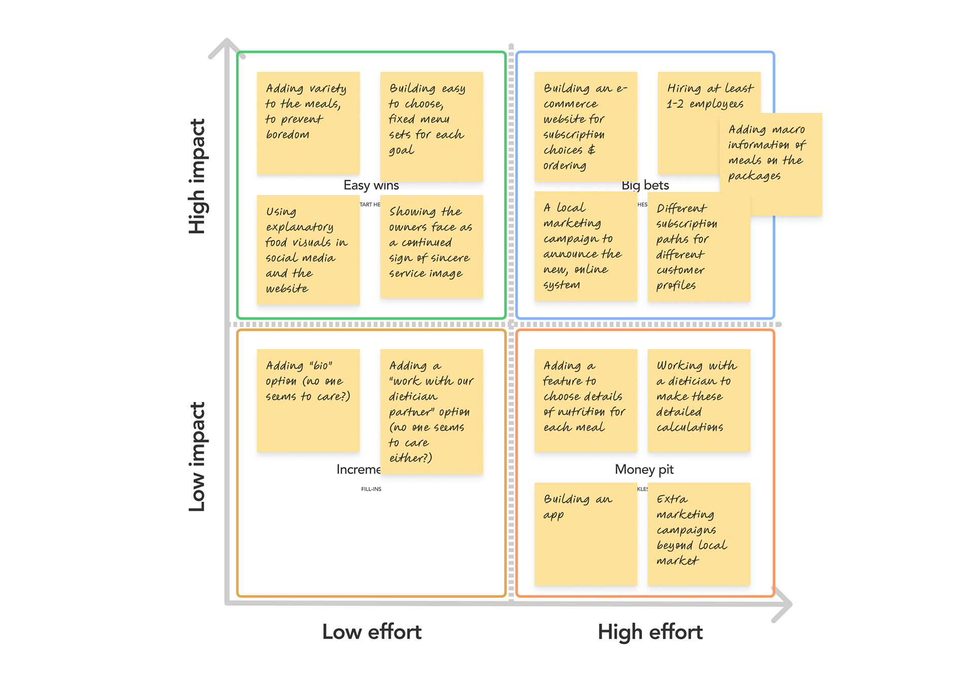
Priority Map
Designing a new user flow and wireframes
The user flow which is seen here has been changed afterwards according to the feedbacks. But the last version finally gave us clear directions about how to design the wireframes.
The main goal was here to make it clear that this is a subscription based service, and if not, the people who order single meals are also -mostly- our returning customers. "It is not a one time only-fast food restaurant, we are a healthy eating club!"
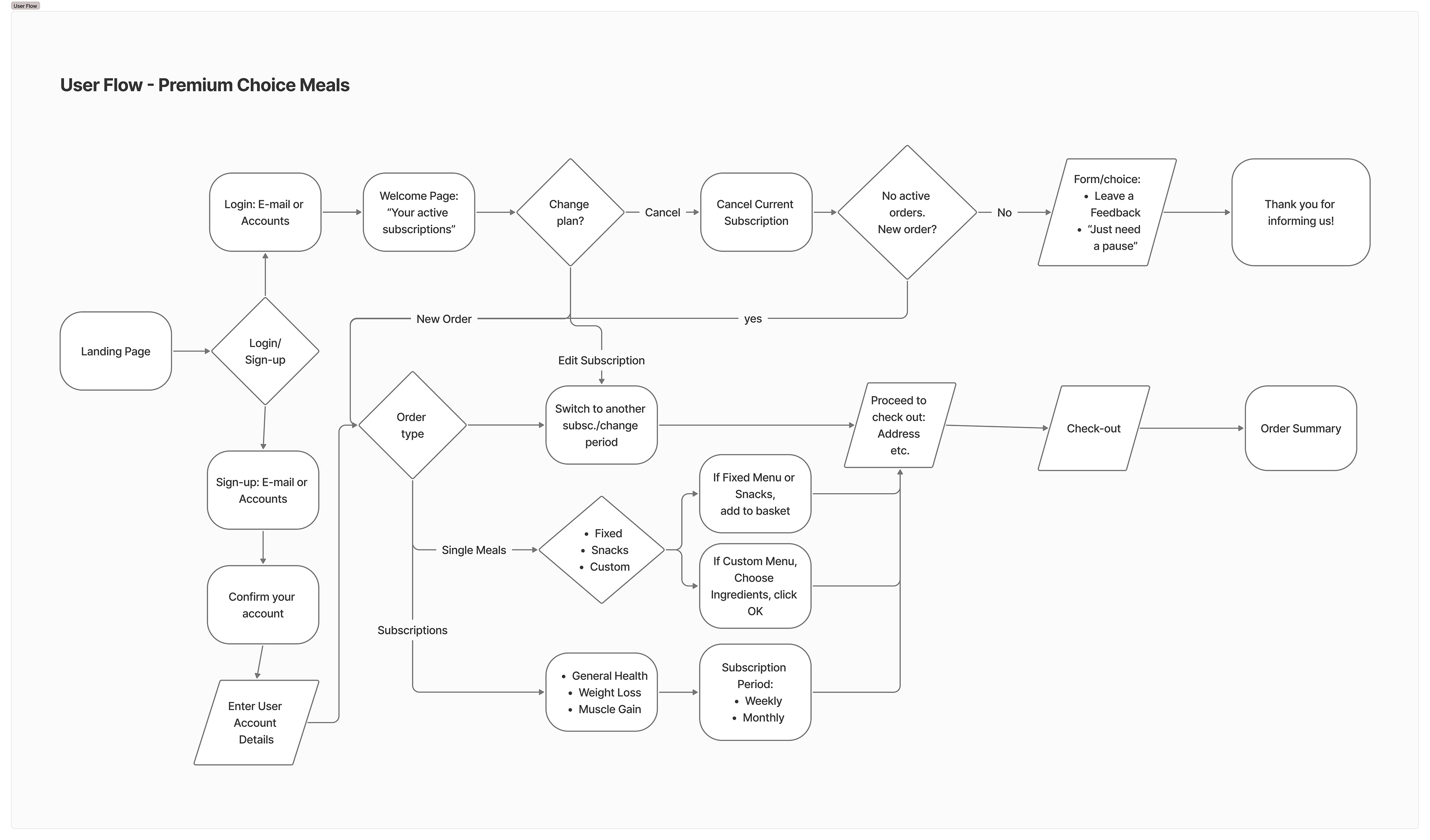
The New User Flow for Premium Choice Meals
Pairwise Comparison Test
We asked our users these 2 questions:
“Which version would you choose from, if you were going to make a healthy meal subscription?” Option B - %85
“Which version would you choose from, if you were going to order a single healthy meal? Option B - %72
So, design B was not only a simpler way to show our users that our business is a merely subscription based system, but also it would be easier for our business owner to follow the new orders in two separate processes types.
Remote Usability Test
With these same low-fi wireframes, we also made a Remote Usability Test. The user’s reactions were better, as expected. But we needed to make small button addition, to improve "User Control and Freedom" according to Nielsen's Heuristics.
Difficulties:
Some users struggled with returning back to the main screen and see the other options again.
Solutions:
We added an easier to navigate “back” and “quit to see single menus” buttons and a process bar on each step.
Success Rates:
On general, most users (%92) found the system very simple to use, if they have a goal in mind and want to start a healthy meal delivery plan.
4. Delivery
The Service Design Blueprint
The new service design should be able to solve many problems on both ends, both on the front stage and at the back stage. My goal was to minimize the workload of the business owner, while making the customer journey as much frictionless as possible.
The Brand Strategy Document
In the mean time, I also delivered the new logo and visual brand identity booklet for Premium Choice Meals.
At the beginning of our journey, our business value was based on "Diet food delivery for fitness enthusiasts and people who are on diet."
After all the research and ideation phases, we changed our value
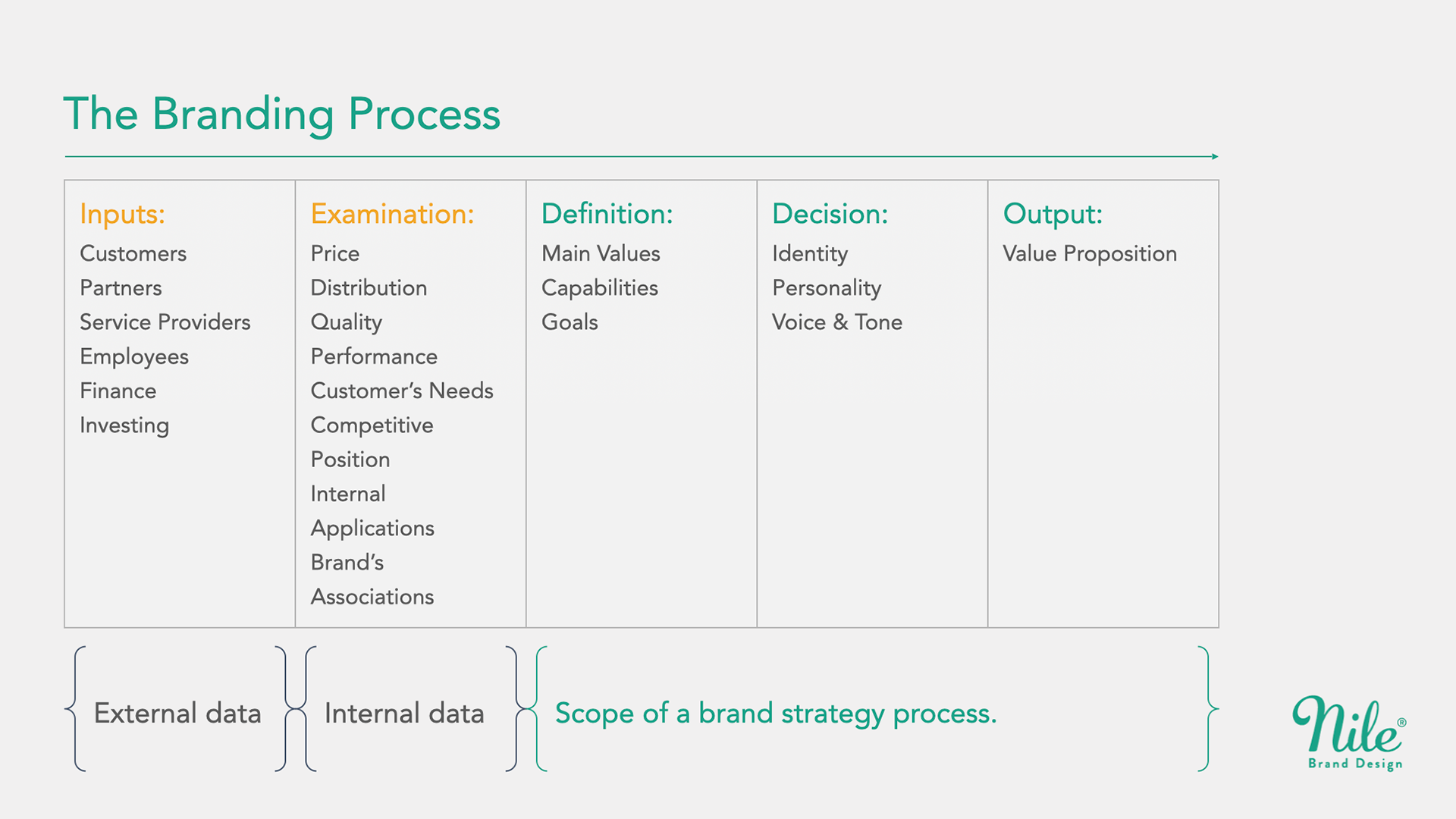
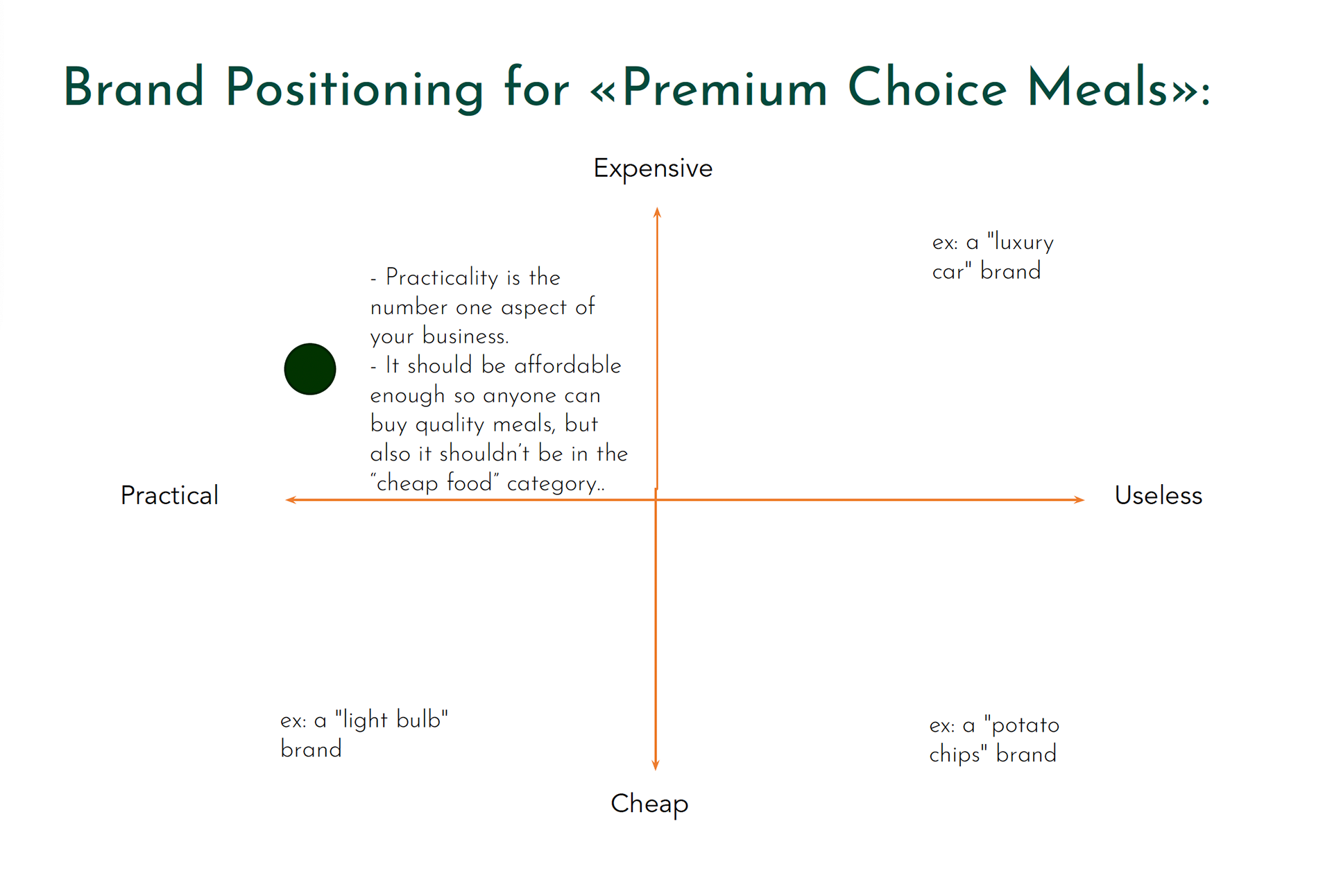
A New Logo, Visual Brand Identity Document, Design Language System (DLS) and New Package Designs
My client's old logo didn't reflect our new brand values and promises, such as high quality, simplicity, speed, practicality etc.
To support the new logo, I designed a new visual brand identity including colours schemes, typography and many other visual rules for further use.
This document helped us Design Language System (DLS) afterwards.
My graphic designer partner Gökhan Aygün designed the package stickers.
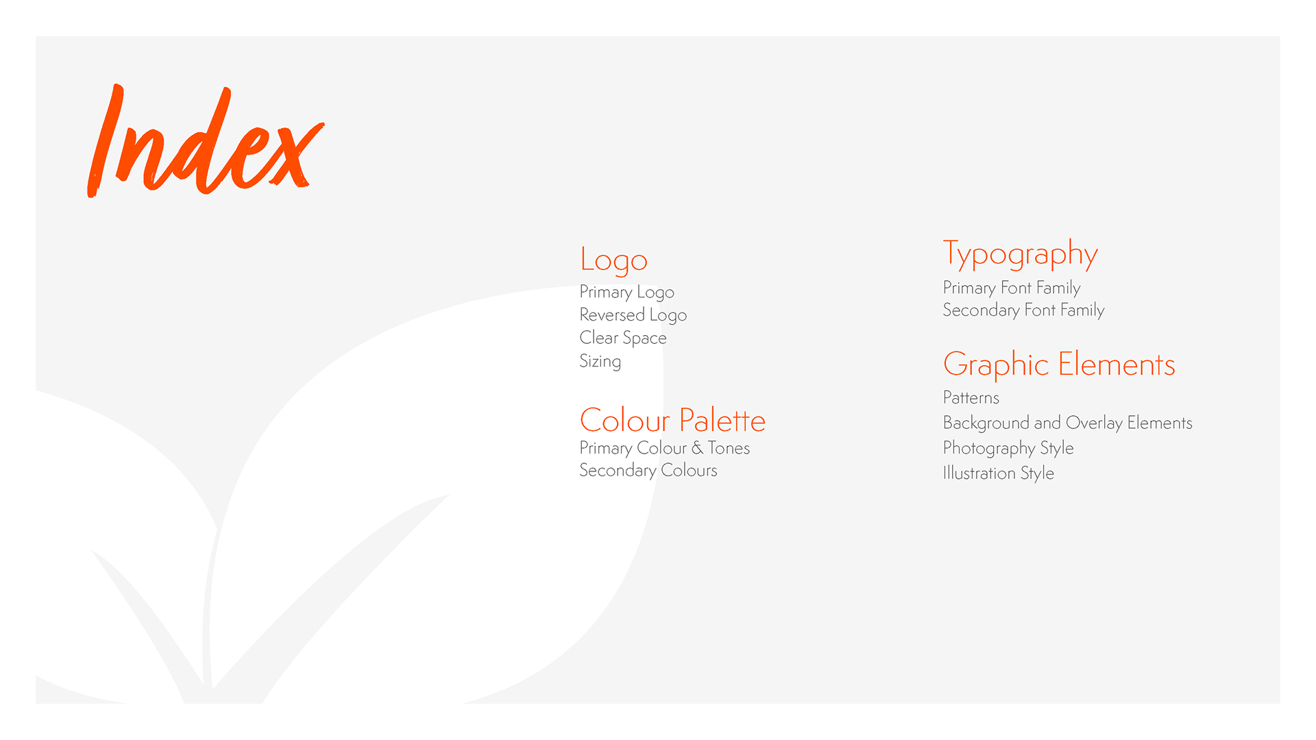
Brand Identity Document Index
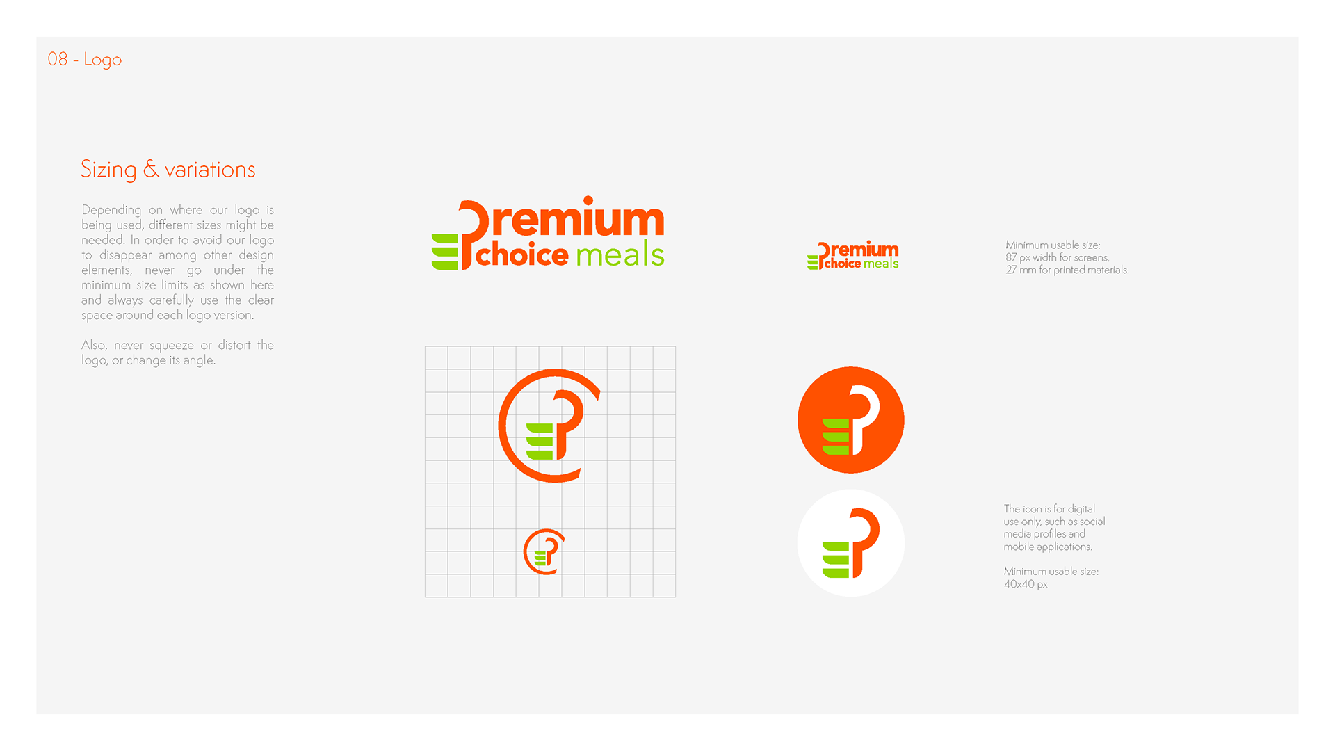
Logo Design
A New E-Commerce Website
For the new website’s UI design, we worked with my freelance graphic designer friend, Gökhan Aygün again.
Following the new Design Language System (DLS) that I had provided him,
he prepared some examples to give an idea to the client about how the new, finished website might look with the new colours and brand image.
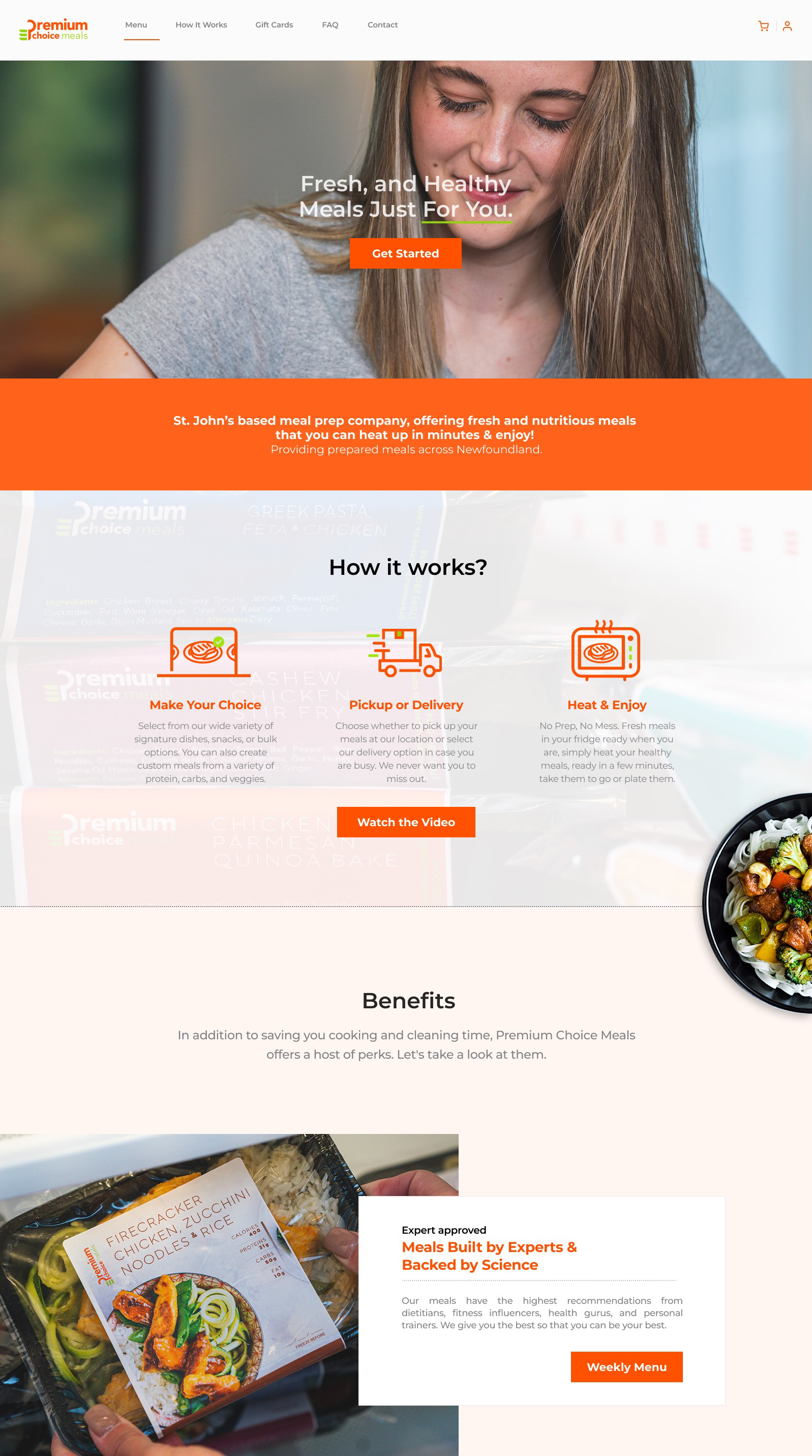
E-Commerce Website
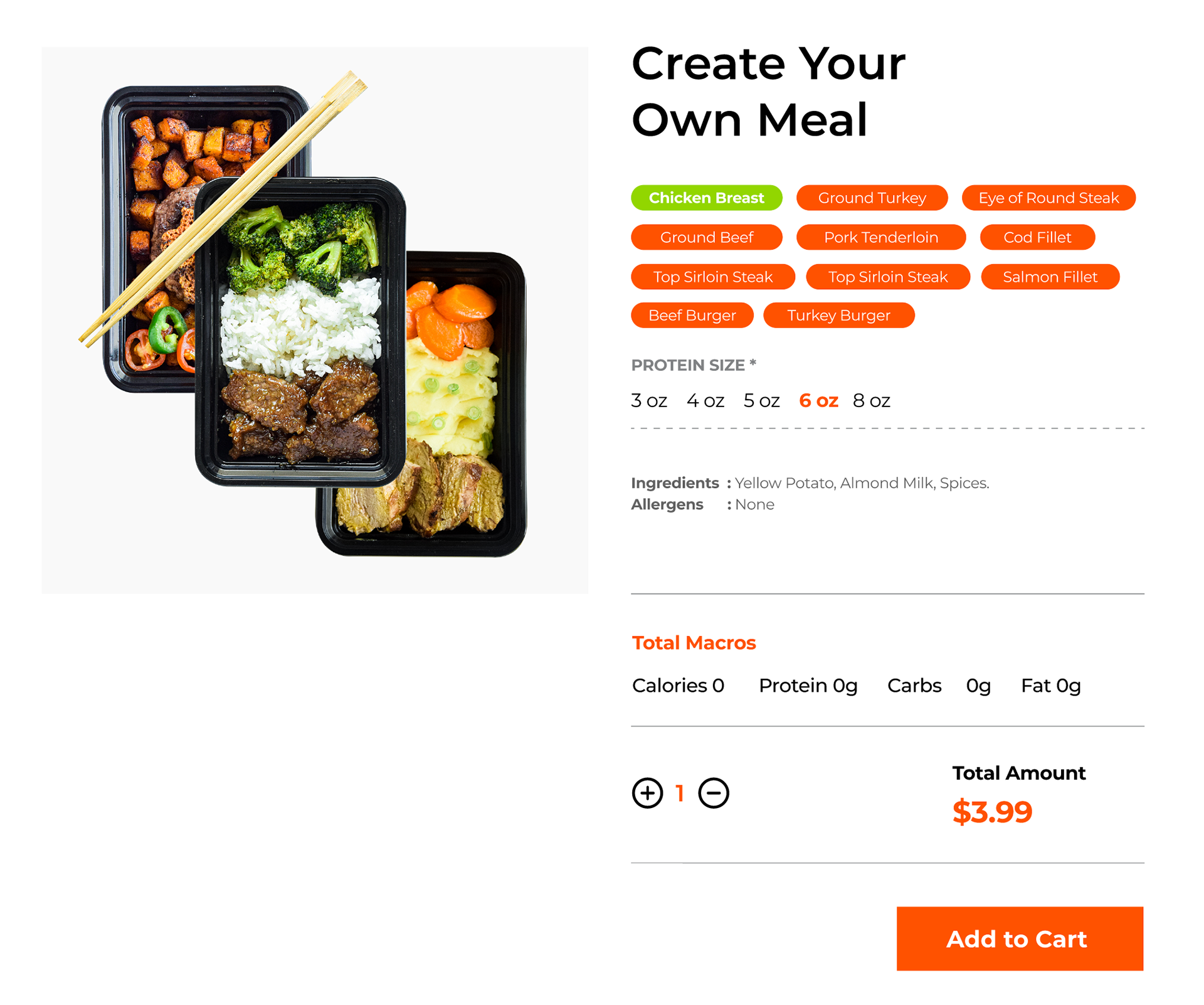
Example Custom Meal Page
Project Results
Strategic Impact
Operational Efficiency: Drastically reduced the founder’s workload by transitioning manual chaos into an automated digital ordering system.
Business Sustainability: Shifted the model toward predictable subscriptions, allowing for better inventory and time management.
Brand-Service Alignment: Created a cohesive Design Language System (DLS) that ensures the brand promise is delivered at every digital touchpoint.
Scalable Foundation: Provided a clear Service Blueprint and roadmap for sustainable growth beyond the "solo-chef" model.
Validation
Client Success: Orders are now received 90%+ online. The founder reported a significant decrease in operational strain, gaining back time for family and strategic planning.
User Feedback: Returning customers reported that the new system is "much easier to navigate," specifically noting the clarity of the subscription options over the previous manual process.
👍
Reflections
The Challenges
Operating as a solo designer across time zones (Canada to Turkey) required rigorous project management. While remote collaboration was a success, the distance limited certain ethnographic research methods that would have been possible in person.
What I Would Do Differently
In a larger team or a longer engagement, I would expand the scope to include:
Metric Tracking: Implementation of HEART metrics or specific KPIs (like conversion rate and churn) to quantify long-term success.
Implementation Strategy: Delivering a full Service Design Package including staff training for the backstage transition.
No-Code Empowerment: Providing a Tool Stack Recommendation to allow the client to manage content updates independently.
Final Takeaway
This project confirmed my belief that Brand Strategy is the root of UX. My brand strategy experience allowed me to see that the "design problem" was actually a business model friction. By solving the Service Design first, the UI became a natural extension of a healthy, sustainable brand.
👉🏻Want to learn more?
(Please contact me for the detailed PDF version of this case study.)


