
"How might we design a platform that offers financial flexibility and motivation for mentees, while maintaining a high-value, premium reputation for mentors?"
About the Project
Client: MentiHub
Business Context: Online Mentorship Platform (SaaS)
Operating Model: Solo Start-Up
My Role: UX Writer, Content Designer, Brand Designer & Strategist, UX Researcher
Final Delivery: Web App Design, User Flows, Brand Strategy, Visual Brand Identity Document & Design Language System (DLS) Document
Methodologies & Tools
Discovery
Secondary Research: Business Model Canvas, Ecosystem Mapping, Competitive Listing
Qualitative Research: User & Founder Interviews
Quantitative Research: Online Survey
Analysis & Ideation
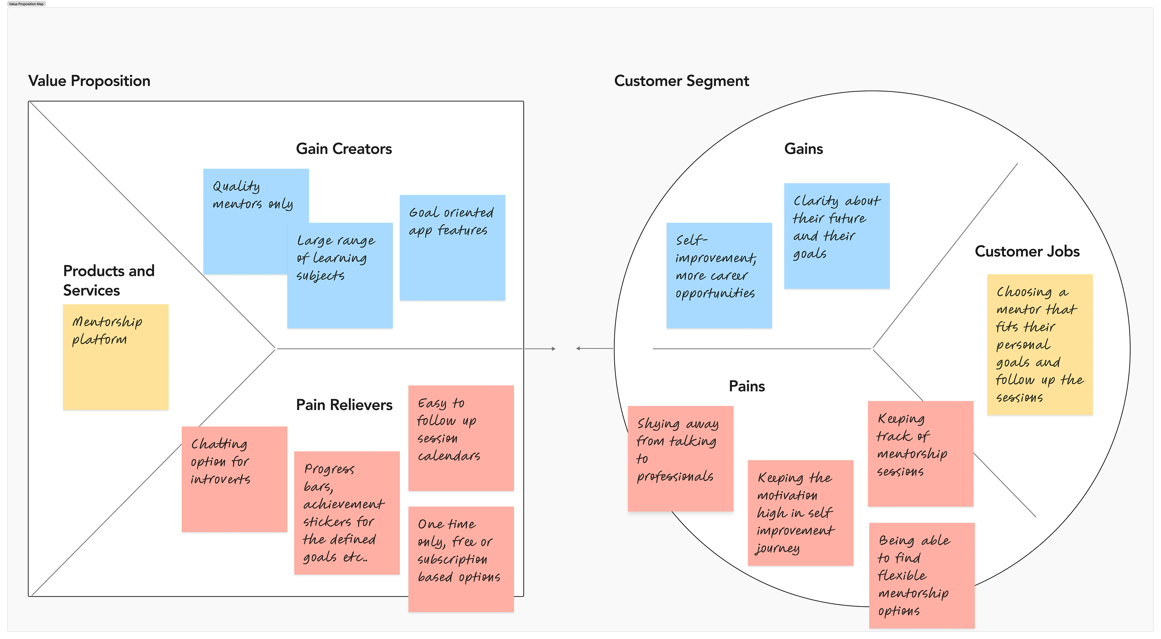
Affinity Map, Business Objective Model Canvas, Value Proposition Canvas, User Personas, User Journeys and Painpoints, Problem Space Perspective Grid
Design
Solution State Perspective Grid, User Flow, To-Be User Journey, Wireframes, Hi-Fi Prototypes, Design Systems
Project Overview
The Backstory
MentiHub was born from a vision of democratizing mentorship. The founder sought a platform built on ethical foundations—specifically, ensuring that high-level guidance is accessible regardless of economic status. My role was to translate this "social impact" philosophy into a viable brand and digital product strategy, incorporating innovative models like "pay-what-you-can" and tiered free-access options.
The Challenge
In a saturated market of established mentorship platforms, MentiHub needed to move beyond a "charity" feel to become a competitive alternative.
The Strategic Paradox: How do we offer radical payment flexibility for mentees without devaluing the expertise of the mentors?
The Differentiation: We had to identify unique value drivers for career changers and professionals that existing platforms were overlooking, particularly regarding motivation and mental well-being.
Problem Statement
The mentorship gap is two-fold:
For Mentees: High barriers to entry due to financial constraints (unemployment, career pivots) and psychological hurdles like burnout or lack of direction.
For Mentors: A need for a credible, trustworthy ecosystem where they can build their professional legacy or generate a side income without compromising their industry status.
The Goal
To engineer a dual-sided web application that harmonizes social impact with professional authority, delivering distinct, tangible benefits to both user groups.
The Solution
Strategic Realignment: Reframed the Value Propositions for both segments, ensuring the business model remained sustainable while upholding its ethical core.
Service Optimization: Engineered a frictionless matching flow that seamlessly integrates the needs of mentees with the availability and requirements of industry experts.
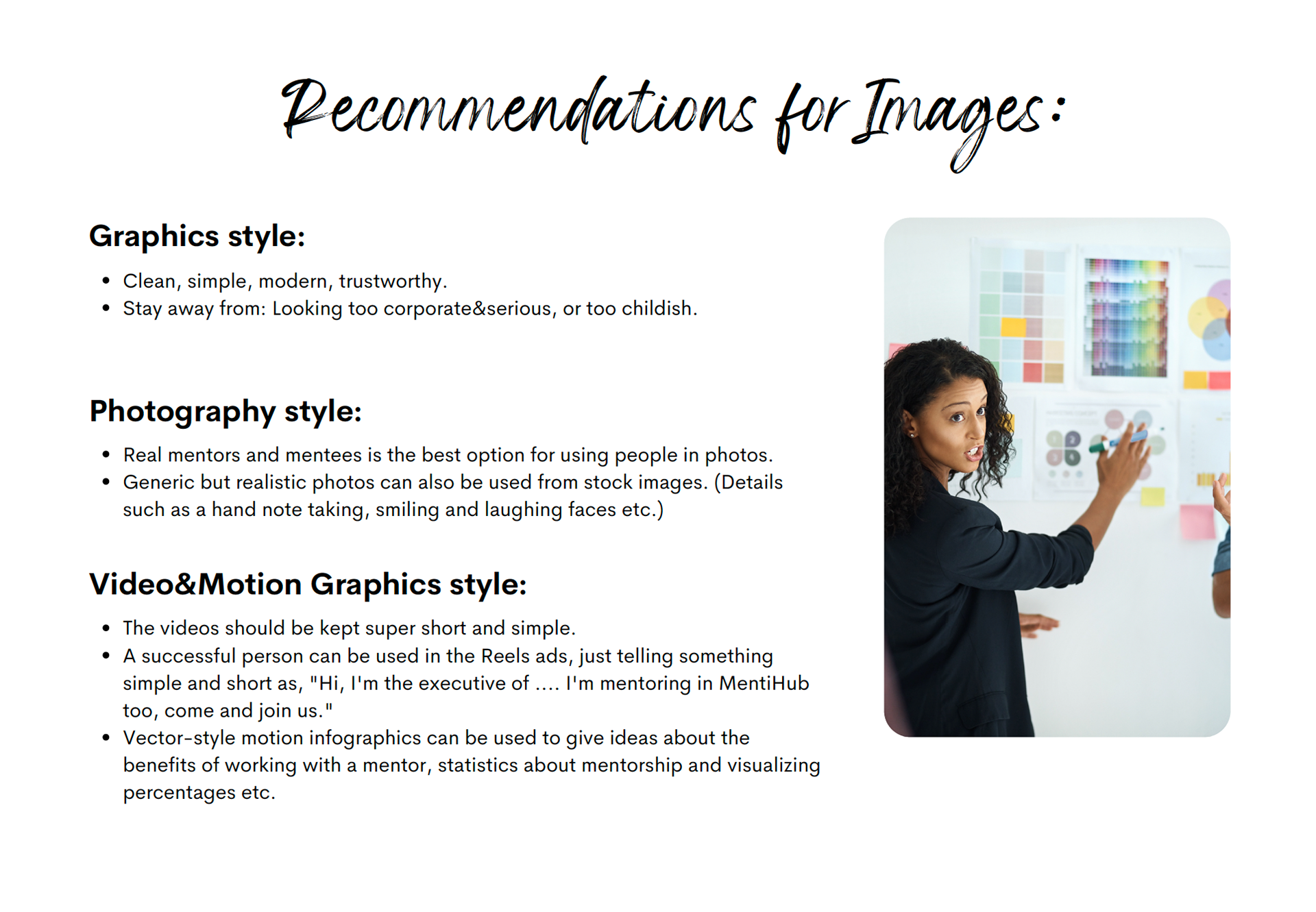
Visual Trust: Developed a robust Brand Strategy and Visual Identity designed to feel familiar and authoritative. The aesthetic was specifically crafted to appeal to a broad spectrum—from C-suite experts to recent graduates.
The "Double Diamond Design" Process Summary
1. Discovery
Understanding the Current Situation
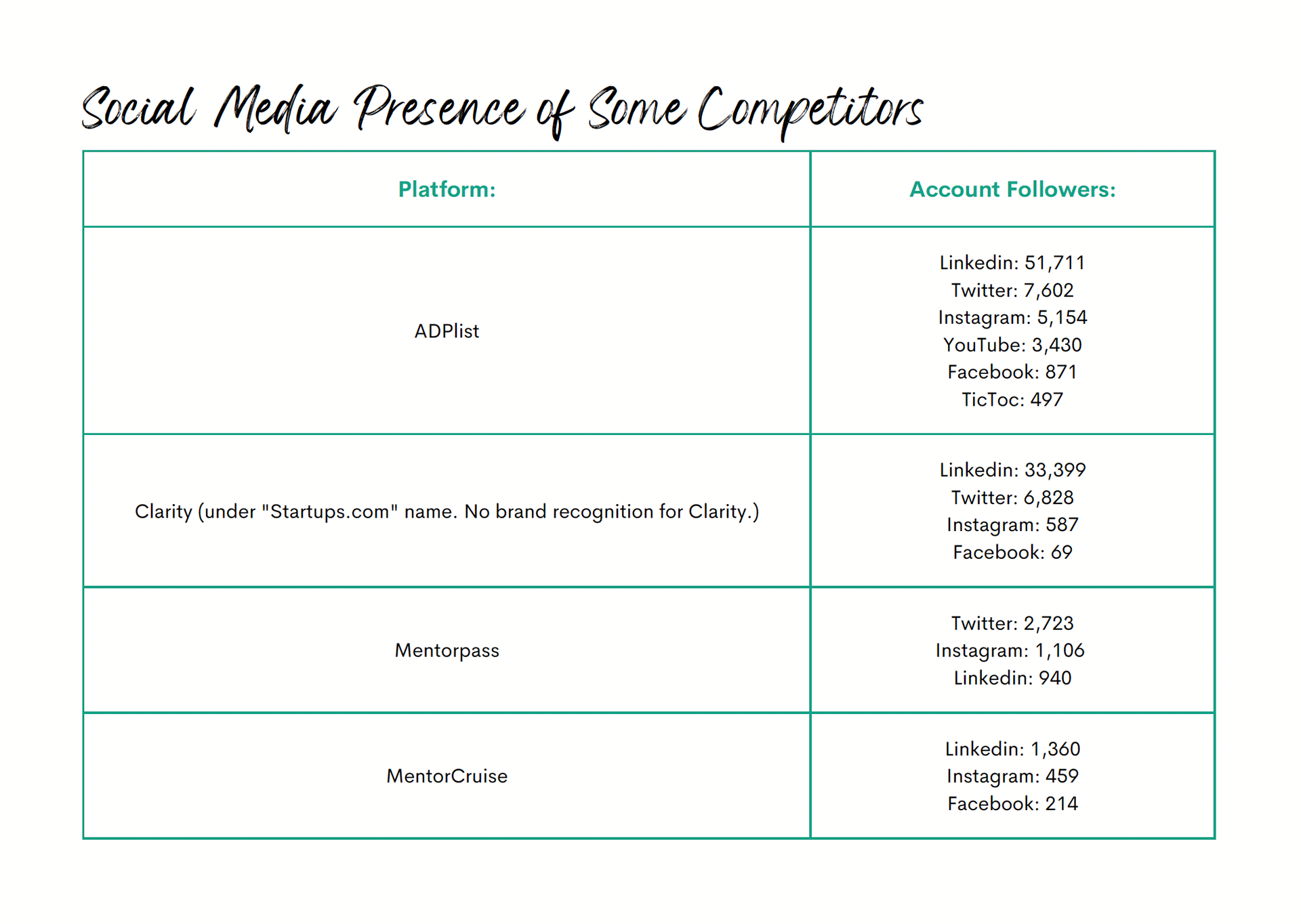
Using secondary research methods like Business Model Canvas, Ecosystem Mapping, Competitive Listing, I mapped out the current situation as a first step, while discussing every statement with my client. I not only researched about the competitor's overall features and user counts, but also their social media presence and comments/common complaints about their platforms.
This way, we were able to see the big picture and start working the challenges and opportunities.
Talking to the Real Professionals, Touching to the Real Issues
Because it was a new business, my client didn't have a user pool for our qualitative and quantitative researches.
So, we conducted an online survey (Google) among 30 people whom we already know.
We also made interviews with a few people who already use such a platform, or benefited mentorship programs or gave mentorship to the others in the past.
So, we conducted an online survey (Google) among 30 people whom we already know.
We also made interviews with a few people who already use such a platform, or benefited mentorship programs or gave mentorship to the others in the past.
2. Definition
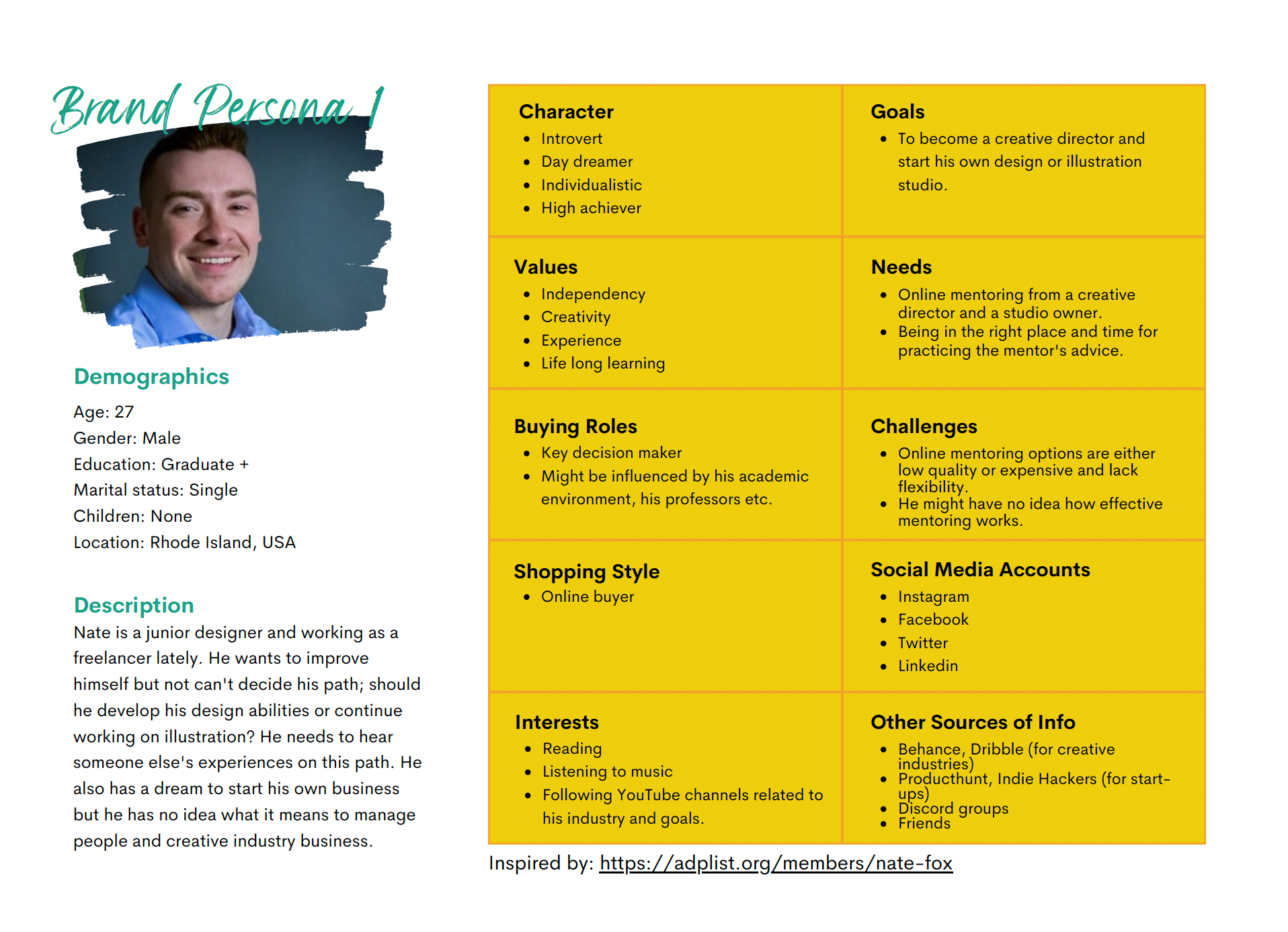
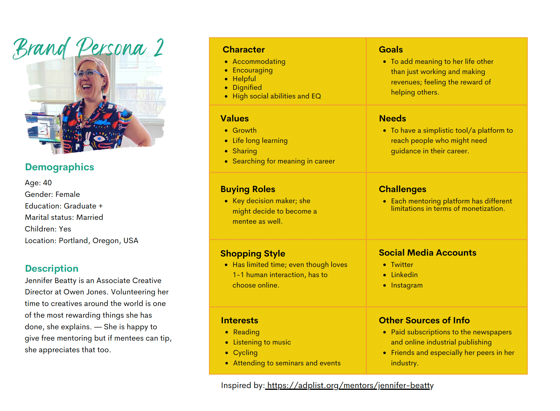
Defining Our Users
It turns out, our potential users were made of mostly "introvert personalities". When an extravert needed help, they benefited mostly from network events. But for the introverts, using a platform such as MentiHub would be their go-to option.
This gave us a different approach about what type of features should we include in our platform. Maybe, a written communication before a call session would be a less stressful option?
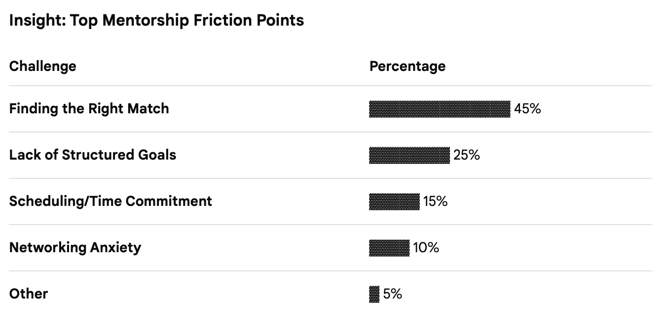
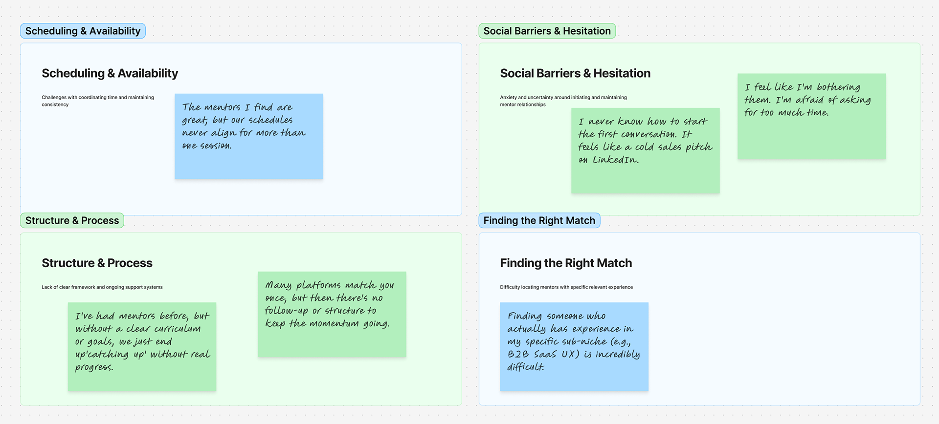
The Pain Points
After the research phase, I used affinity mapping method and conducted an online brainstorming session with my client over Figma.
According to some key frustrations, we understood that offering flexibility is not only essential, but also it needed to be integrated in many other subjects.
So, we made sure to think beyond "financial flexibilities", and add some other features that will benefit that flexibility on both sides.
On the mentor's part, however, the complaints were totally different: Many of them were "ghosted" by the mentees time to time and it was difficult for them to grasp the core reason.
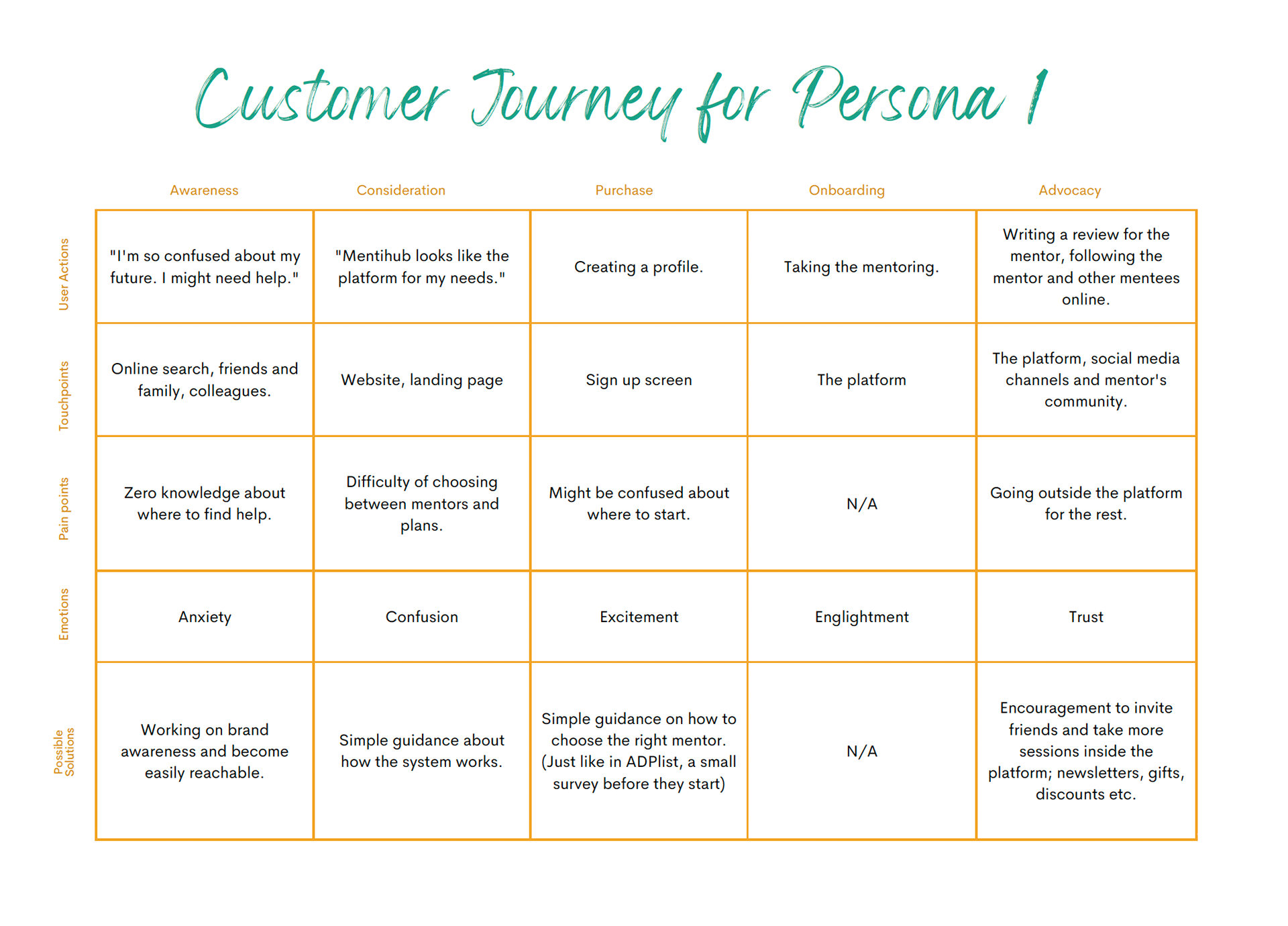
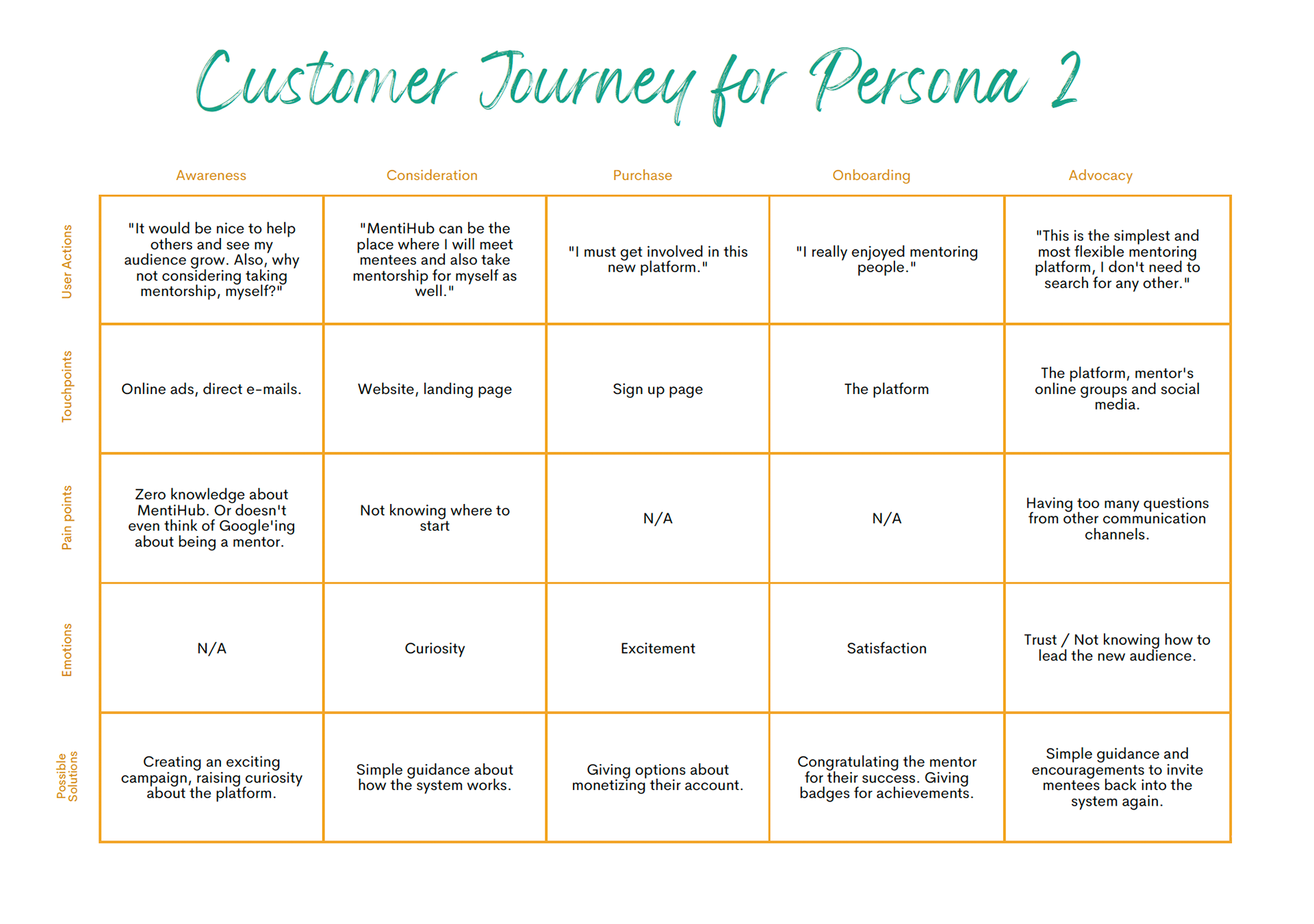
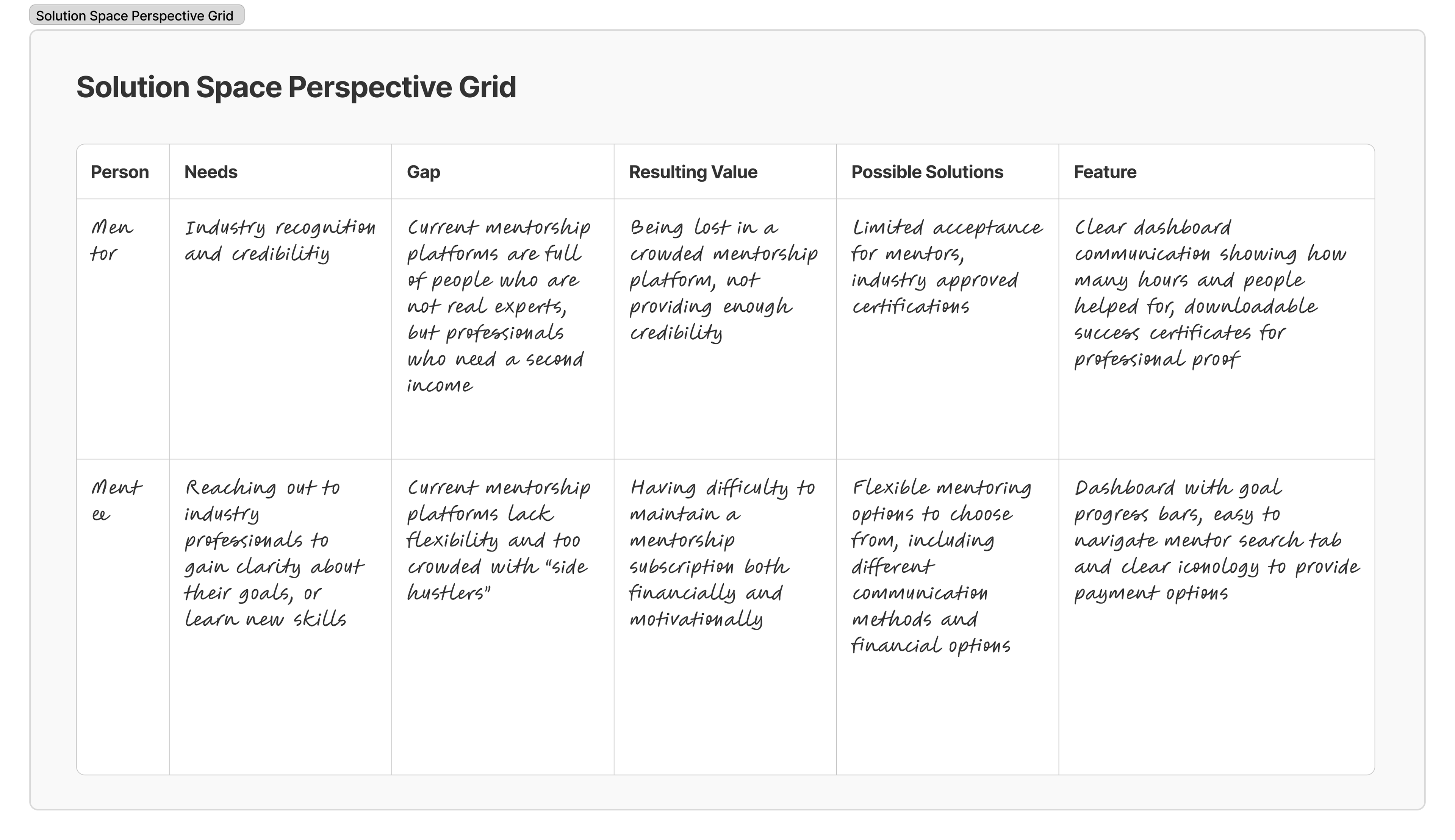
Problem State Perspective Grid and To-Be Customer Journey Mapping
I used the problem state perspective grid, because our clients were not yet established and we were trying to figure out the potential in the market.
According to the key findings from our research results and based on our newly defined user personas, my client and I defined the most critical steps after on boarding.
3. Design
Thinking about the possible solutions that will benefit both ends
The start-up owner's main goal was to design a platform based on real issues in mentorship relations, not just a profitability focused digital business.
Because my client was a solo start-up owner, I knew that his budget has limitations. So, we planned the next actions according the priority map.
We chose to focus on the easy wins first, such as adding motivational elements, progress bars to the dashboard. For the more complicated subjects such as building a special payment system that will allow "give-away credits", we decided to take our time and wait for the next iteration period.
User flow
I designed two different user flows, for the mentee and the mentors.
The platform was aimed to be on a flat hierarchy, where users can easily navigate through everything on one single screen.
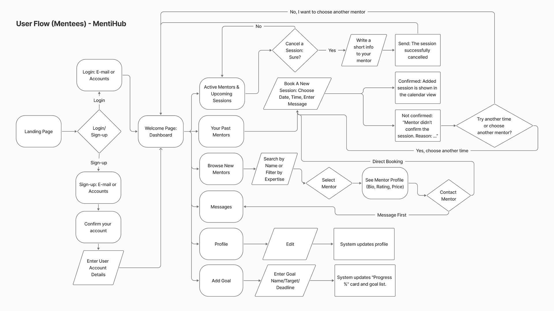
User Flow (Mentees) - MentiHub
Remote Usability Test
With low-fi wireframes, we also made a Remote Usability Test. This test made us reconsider our user's Nielsen's Heuristics
Difficulties:
Some users complained that once they are in the dashboard mode, they were unable to search the mentors. They had to return to the main screen.
Solutions:
We added "Browse Mentors" tab to the user dashboard.
Success Rates:
As a result, most users (%84) found the system very simple to use, and more importantly, much more diverse and flexible compared to other mentorship platforms (if they used any).
4. Delivery
The new platform design should be able to solve many problems on both ends.
My goal was to minimize the frictions for the mentors, who were usually busy and mentorship was not their primary job, while maximising the motivational aspects on the mentee part, so they don't feel lost or "ghost" their mentors.
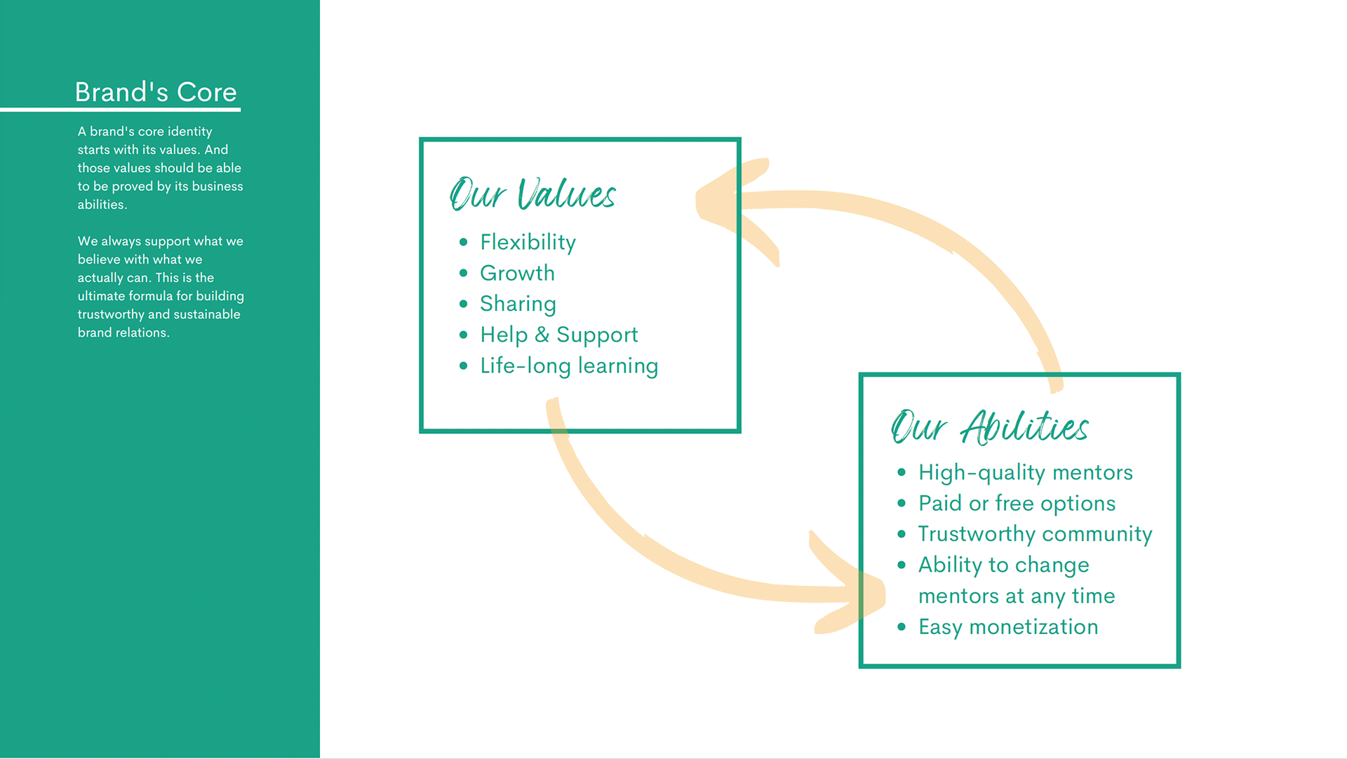
As a principle, I always build a new design solution on a complete brand identity and strategy.
So, I prepared a detailed branding document first, including the core business values, mission, vision statements and customer value propositions.
Based on these brand strategy, I delivered the new logo and visual brand identity booklet for MentiHub, which also helped me finalize the Design Language System (DLS) at the end.
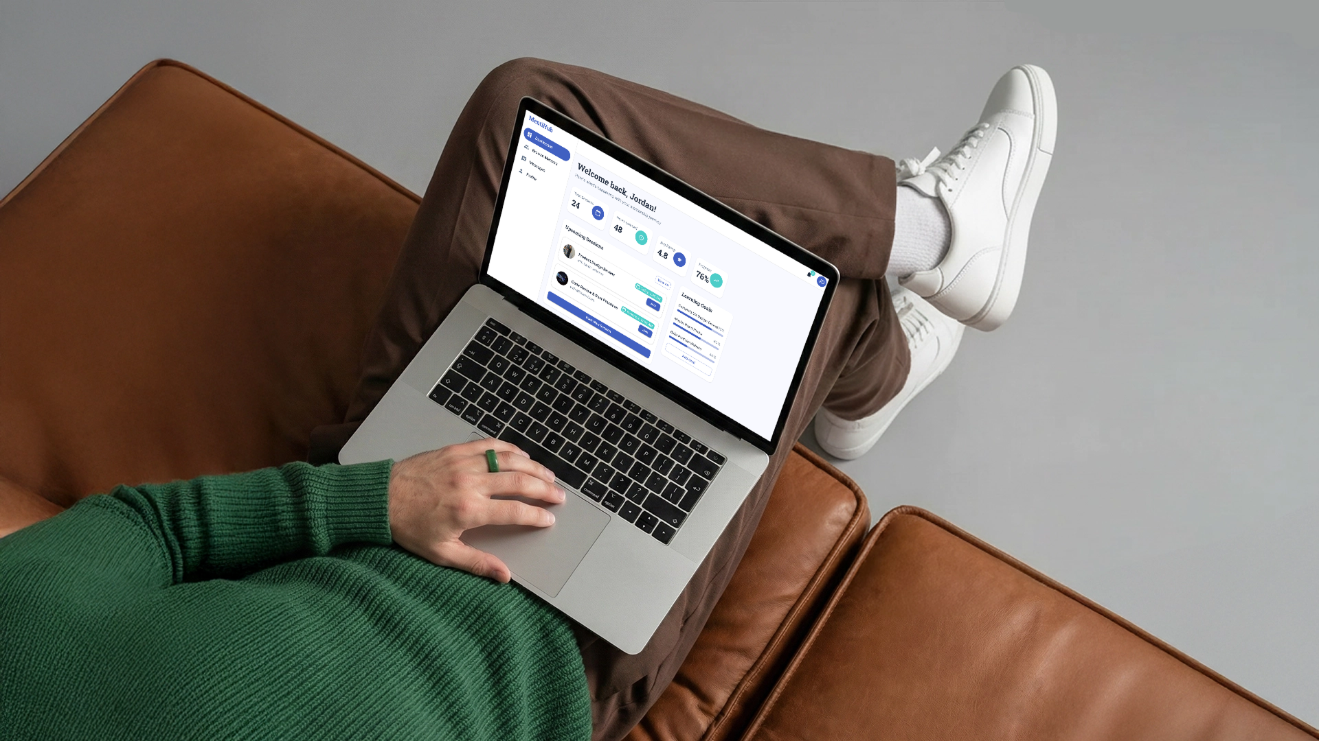
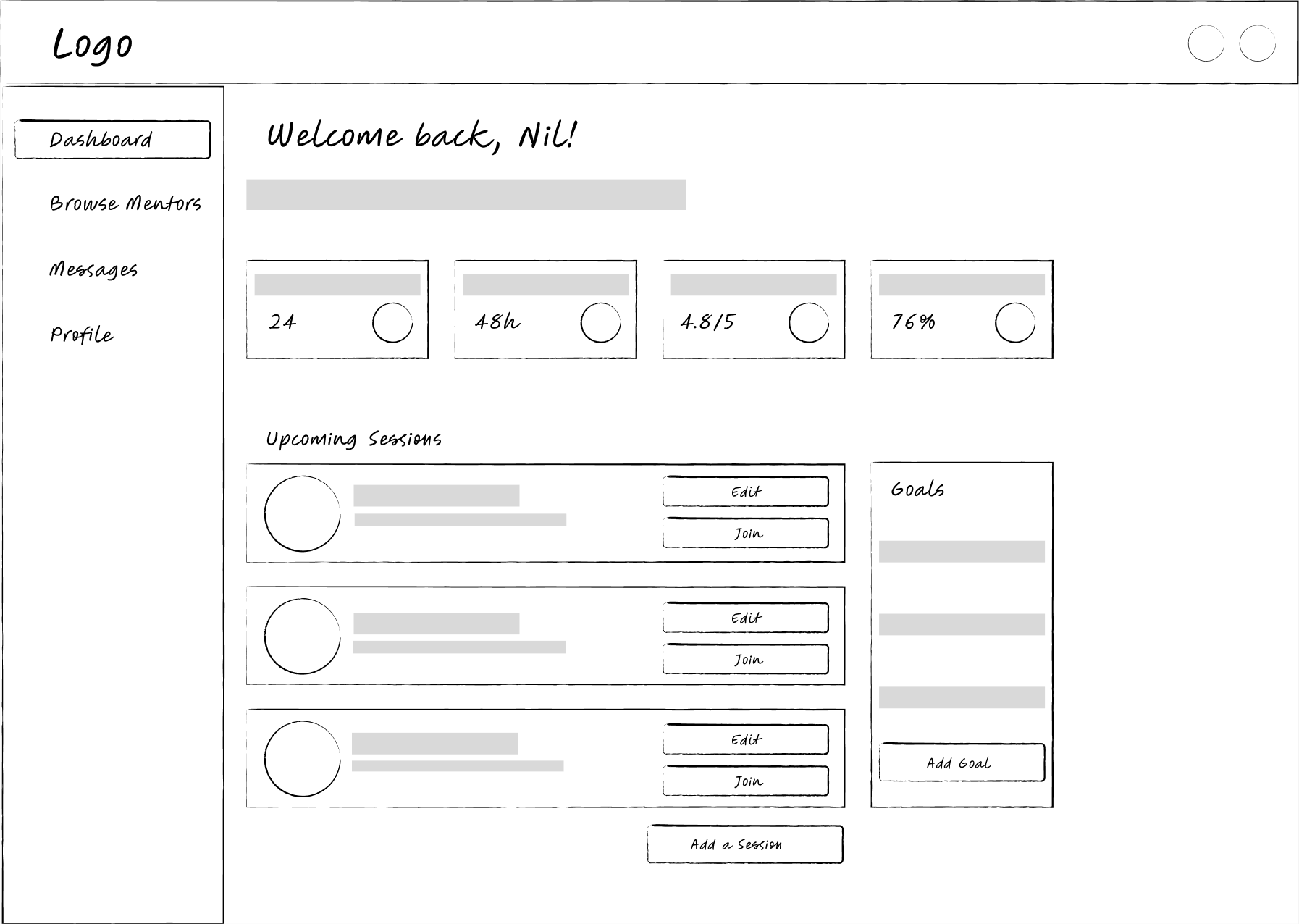
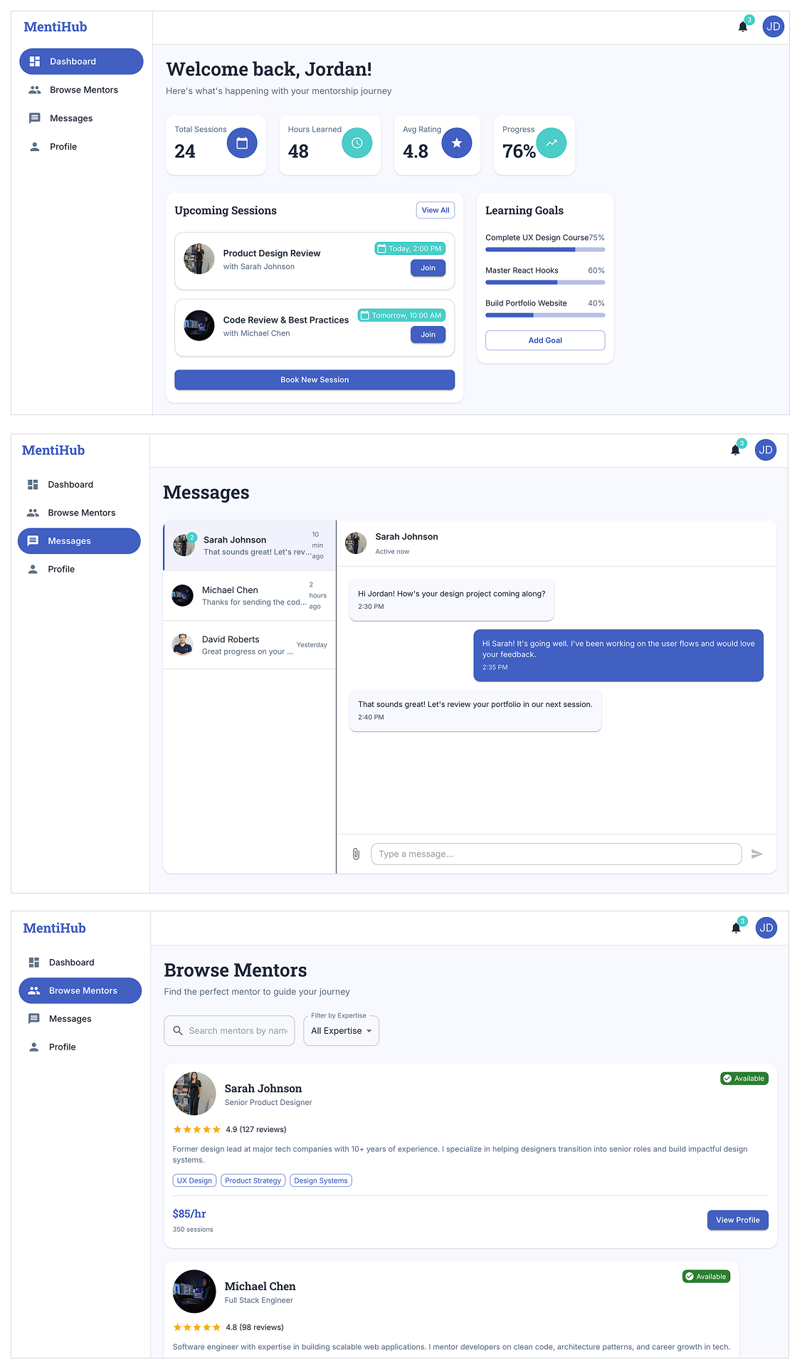
The Desktop App Dashboard
The final dashboard design was simple enough to navigate, and rich enough for our prioritised design decisions.
For the mentee screen, we put more emphasise on the motivation factor; by adding goal achievement progress bars and clearly showing hours learned, total sessions etc.
For the mentor screen, we put more emphasise on the increase of credibility, by adding trustworthiness score, hours spent helping and a limited"top mentors" badge, which they can download as a certificate.
Project Results
Summary
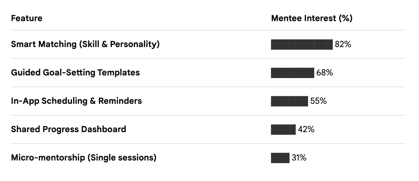
- Deep Insight into Mentorship Barriers: Identified that structural voids (lack of agendas/goals) are greater deterrents than a lack of available mentors.
- Strategic Feature Roadmap: Defined a high-impact MVP focusing on smart-matching and automated session scheduling to solve top-voted user pain points.
- Brand-User Alignment: Established a brand identity centered on "Approachable Professionalism" to reduce the "cold outreach anxiety" reported by 45% of potential mentees.
- Scalable Architecture: Designed a modular user flow that supports both one-time "flash" mentorships and long-term structured programs.
- Optimized Onboarding Flow: Developed a data-driven matching questionnaire that reduces manual searching time for users by an estimated 60%.
User/Customer Validation
Initial feedback from our research cohort regarding the MentiHub concept was overwhelmingly positive. While the app is currently in the high-fidelity prototyping stage, we conducted concept testing with the same group of potential mentors and mentees who participated in our initial market survey.
Overall, participants noted that the "Session Agenda Builder" and "Niche-Specific Filtering" addressed their primary fears of "awkward first meetings" and "irrelevant matches." Because these structural features were the highest-rated requirements during our discovery phase, the prototype saw a high task-success rate. I have recommended moving into a Beta Pilot program next to track long-term retention beyond the first three sessions.
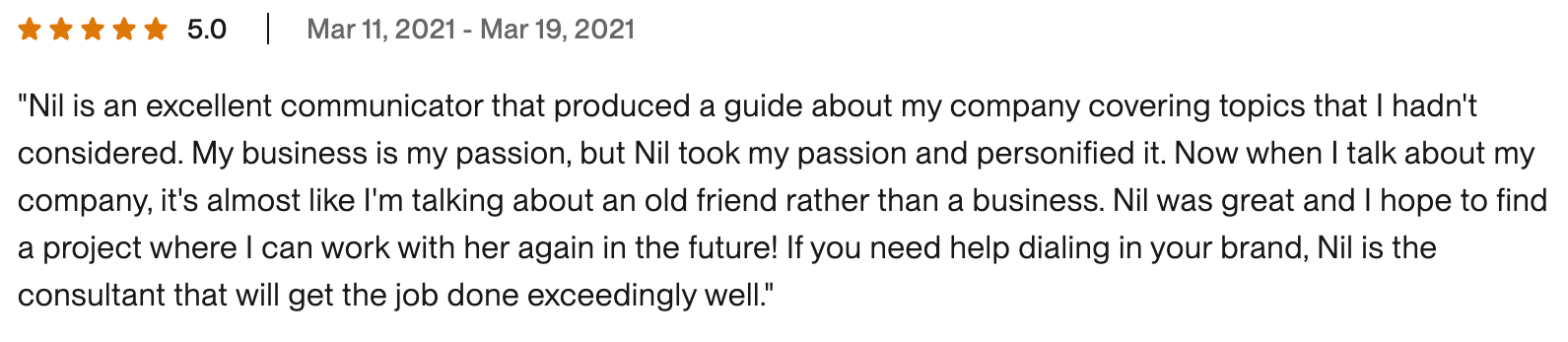
Client Validation
The start-up owner expressed high confidence in the data-backed roadmap. By translating raw survey data into an Affinity Map, the design direction shifted from a simple directory to a productivity-first tool. This strategic pivot ensured that the development team would focus on building the "Goal Tracking" engine first, which users identified as the most critical value-add. (The feedback below is taken from Upwork).
👍
Reflections
Some Personal Challenges
- Solo working
- Distance limitations to some research methods
- Not able to follow up or iterate the next steps
What Would I Do Differently?
If my services were not limited to research and design phases only and I was working in a larger team, I could consider:
- Catching up with my client after project delivery and find out further metrics about the new, live design, such as KPIs or HEART metrics.
- Contribute my client’s new service design transition period, by delivering a full service design package, including Implementation Strategy.
- Giving my client Tool Stack Recommendations, so he might design some parts of the project with no-code platforms.
Things I’m Feeling Good About:
Remote communication - Despite the long distance and hour differences between each of us (USA and Turkiye), and using a freelancer platform (Upwork), we worked remotely but communicated fluently.
Prioritising the core problem solving - I’m glad that I didn’t rush my client, and advised him about the importance of research-first approach.
Combining the brand strategy experience with service design - It was a big experience to see that my past knowledge in marketing had so many common points when it comes to designing low friction customer experiences.
👉🏻Want to learn more?
(Please contact me for the detailed PDF version of this case study.)